Excel Power Pivot – 快速指南
Excel Power Pivot – 快速指南
Excel Power Pivot – 概述
Excel Power Pivot 是一种高效、强大的工具,它作为 Excel 插件附带。借助 Power Pivot,您可以从外部源加载数亿行数据,并使用其强大的 xVelocity 引擎以高度压缩的形式有效管理数据。这使得执行计算、分析数据并得出报告以得出结论和决策成为可能。因此,具有 Excel 实践经验的人可以在几分钟内执行高端数据分析和决策。
本教程将涵盖以下内容 –
Power Pivot 功能
使 Power Pivot 成为强大工具的原因在于其功能集。您将在“Power Pivot 功能”一章中了解各种 Power Pivot 功能。
来自各种来源的 Power Pivot 数据
Power Pivot 可以整理来自各种数据源的数据以执行所需的计算。您将在 – 将数据加载到 Power Pivot 一章中了解如何将数据导入 Power Pivot。
Power Pivot 数据模型
Power Pivot 的强大之处在于它的数据库——数据模型。数据以数据表的形式存储在数据模型中。您可以在数据表之间创建关系以组合来自不同数据表的数据以进行分析和报告。一章 – 理解数据模型(Power Pivot 数据库)为您提供了有关数据模型的详细信息。
管理数据模型和关系
您需要知道如何管理数据模型中的数据表以及它们之间的关系。您将在“管理 Power Pivot 数据模型”一章中获得这些详细信息。
创建 Power 数据透视表和 Power 数据透视图
Power PivotTables 和 Power Pivot Charts 为您提供了一种分析数据以得出结论和/或决策的方法。
您将在章节中学习如何创建 Power PivotTables – 创建 Power PivotTable 和 Flattened PivotTables。
您将在 – Power PivotCharts 一章中学习如何创建 Power PivotCharts。
DAX 基础知识
DAX 是 Power Pivot 中用于执行计算的语言。DAX 中的公式类似于 Excel 公式,但有一个区别 – Excel 公式基于单个单元格,而 DAX 公式基于列(字段)。
您将在 – DAX 基础一章中了解 DAX 的基础知识。
探索和报告 Power Pivot 数据
您可以使用 Power PivotTables 和 Power Pivot Chart 探索数据模型中的 Power Pivot 数据。在本教程中,您将了解如何探索和报告数据。
层次结构
您可以在数据表中定义数据层次结构,以便在 Power PivotTables 中轻松处理相关数据字段。您将在 – Power Pivot 中的层次结构一章中了解层次结构的创建和使用的详细信息。
美学报告
您可以使用 Power Pivot Charts 和/或 Power Pivot Charts 创建数据分析的美学报告。您可以使用多种格式选项来突出显示报告中的重要数据。这些报告本质上是交互式的,使查看紧凑报告的人能够快速轻松地查看任何所需的详细信息。
您将在章节中了解这些详细信息 – 带有 Power Pivot 数据的美学报告。
Excel Power Pivot – 安装
Excel 中的 Power Pivot 提供了一个连接各种不同数据源的数据模型,可以在此基础上分析、可视化和探索数据。Power Pivot 提供的易于使用的界面使具有 Excel 实践经验的人能够轻松加载数据、将数据作为数据表进行管理、在数据表之间创建关系以及执行所需的计算以得出报告.
在本章中,您将了解是什么让 Power Pivot 成为分析师和决策者追捧的强大工具。
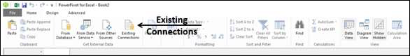
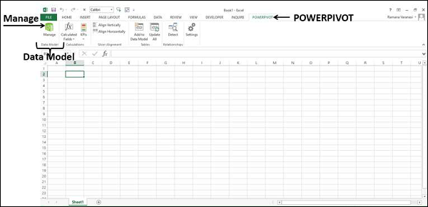
功能区上的 Power Pivot
继续 Power Pivot 的第一步是确保 POWERPIVOT 选项卡在功能区上可用。如果您有 Excel 2013 或更高版本,则功能区上会显示 POWERPIVOT 选项卡。
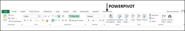
如果您有 Excel 2010,如果您尚未启用 Power Pivot 加载项,则功能区上可能不会出现POWERPIVOT选项卡。
Power Pivot 插件
Power Pivot 加载项是一个 COM 加载项,需要启用它才能在 Excel 中获得 Power Pivot 的完整功能。即使 POWERPIVOT 选项卡出现在功能区上,您也需要确保加载项已启用以访问 Power Pivot 的所有功能。
步骤 1 – 单击功能区上的文件选项卡。
步骤 2 – 单击下拉列表中的选项。出现 Excel 选项对话框。
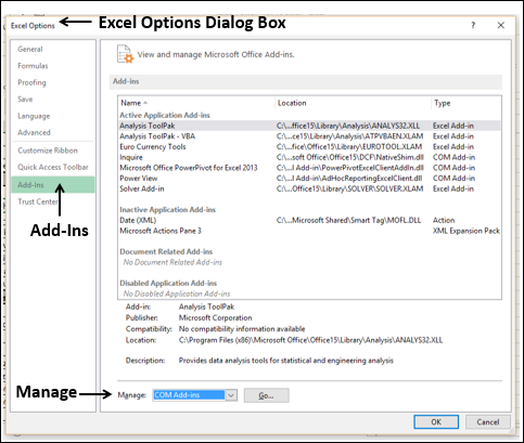
步骤 3 – 按照以下说明进行操作。
-
单击加载项。
-
在管理框中,从下拉列表中选择 COM 加载项。
-
单击“前往”按钮。出现 COM 加载项对话框。
-
选中 Power Pivot,然后单击确定。
什么是 Power Pivot?
Excel Power Pivot 是一种用于集成和处理大量数据的工具。使用 Power Pivot,您可以轻松加载、排序和筛选包含数百万行的数据集并执行所需的计算。您可以将 Power Pivot 用作临时报告和分析解决方案。
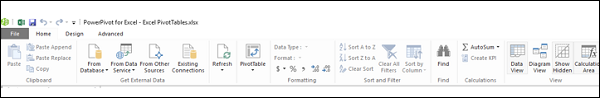
如下所示的 Power Pivot 功能区具有各种命令,范围从管理数据模型到创建报告。

Power Pivot 窗口将具有如下所示的功能区 –
为什么 Power Pivot 是强大的工具?
当您调用 Power Pivot 时,Power Pivot 会创建数据定义和连接,这些数据定义和连接以压缩形式与 Excel 文件一起存储。当源中的数据更新时,它会在您的 Excel 文件中自动刷新。这有利于使用在别处维护的数据,但它是研究时常研究和做出决定所必需的。源数据可以是任何形式——从文本文件或网页到不同的关系数据库。
PowerPivot 窗口中 Power Pivot 的用户友好界面使您无需了解任何数据库查询语言即可执行数据操作。然后,您可以在几秒钟内创建分析报告。这些报告是多功能的、动态的和交互式的,使您能够进一步探索数据以获得洞察力并得出结论/决策。
您在 Excel 和 Power Pivot 窗口中处理的数据存储在 Excel 工作簿内的分析数据库中,强大的本地引擎会加载、查询和更新该数据库中的数据。由于数据位于 Excel 中,因此它可以立即用于数据透视表、数据透视图、Power View 和 Excel 中用于聚合数据并与数据交互的其他功能。数据表示和交互由 Excel 提供,数据和 Excel 表示对象包含在同一个工作簿文件中。Power Pivot 支持最大 2GB 的文件,并使您能够在内存中处理多达 4GB 的数据。
使用 Power Pivot 将功能强大到 Excel
Power Pivot 功能在 Excel 中是免费的。Power Pivot 通过包括以下功能的强大功能增强了 Excel 性能 –
-
能够以惊人的速度处理大量数据,压缩成小文件。
-
导入时过滤数据并重命名列和表。
-
与分布在整个工作簿中的 Excel 表或同一工作表中的多个表相比,将表组织到 Power Pivot 窗口中的单个选项卡式页面中。
-
创建表之间的关系,以便对表中的数据进行集中分析。在 Power Pivot 之前,在进行此类分析之前,必须依赖大量使用 VLOOKUP 函数将数据合并到单个表中。这曾经是费力且容易出错的。
-
为简单的数据透视表添加许多附加功能。
-
提供数据分析表达式 (DAX) 语言来编写高级公式。
-
将计算字段和计算列添加到数据表。
-
创建要在数据透视表和 Power View 报告中使用的 KPI。
您将在下一章中详细了解 Power Pivot 功能。
Power Pivot 的用途
您可以将 Power Pivot 用于以下用途 –
-
执行强大的数据分析并创建复杂的数据模型。
-
快速混合来自多个不同来源的大量数据。
-
执行信息分析并以交互方式分享见解。
-
使用数据分析表达式 (DAX) 语言编写高级公式。
-
创建关键绩效指标 (KPI)。
使用 Power Pivot 进行数据建模
Power Pivot 在 Excel 中提供高级数据建模功能。Power Pivot 中的数据在也称为 Power Pivot 数据库的数据模型中进行管理。您可以使用 Power Pivot 帮助您获得对数据的新见解。
您可以创建数据表之间的关系,以便您可以对这些表进行统一的数据分析。使用 DAX,您可以编写高级公式。您可以在数据模型的数据表中创建计算字段和计算列。
您可以在数据中定义层次结构以在工作簿中的任何地方使用,包括 Power View。您可以创建 KPI 以在数据透视表和 Power View 报告中使用,以一目了然地显示一个或多个指标的性能是否达到目标。
使用 Power Pivot 进行商业智能
商业智能 (BI) 本质上是人们用来收集数据、将其转化为有意义的信息,然后做出更好决策的一组工具和流程。Excel 中 Power Pivot 的 BI 功能使您能够跨多个设备收集数据、可视化数据并与组织中的人员共享信息。
您可以将工作簿共享到启用了 Excel Services 的 SharePoint 环境。在 SharePoint 服务器上,Excel Services 在其他人可以分析数据的浏览器窗口中处理和呈现数据。
Excel Power Pivot – 功能
Power Pivot 最重要和最强大的功能是它的数据库 – 数据模型。下一个重要功能是 xVelocity 内存分析引擎,它可以在几分钟内处理大型多个数据库。PowerPivot 插件附带了一些更重要的功能。
在本章中,您将简要概述 Power Pivot 的功能,稍后将对其进行详细说明。
从外部来源加载数据
您可以通过两种方式从外部来源将数据加载到数据模型中 –
-
将数据加载到 Excel 中,然后创建 Power Pivot 数据模型。
-
将数据直接加载到 Power Pivot 数据模型中。
第二种方式更高效,因为 Power Pivot 处理内存中的数据的方式更高效。
有关更多详细信息,请参阅一章 – 将数据加载到 Power Pivot。
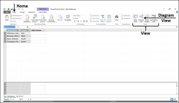
Excel 窗口和 Power Pivot 窗口
当您开始使用 Power Pivot 时,将同时打开两个窗口 – Excel 窗口和 Power Pivot 窗口。通过 PowerPivot 窗口,您可以直接将数据加载到数据模型中,在数据视图和图表视图中查看数据,创建表之间的关系,管理关系,以及创建 Power PivotTable 和/或 PowerPivot Chart 报告。
从外部源导入数据时,不需要 Excel 表中的数据。如果工作簿中有 Excel 表形式的数据,则可以将它们添加到数据模型,在数据模型中创建链接到 Excel 表的数据表。
从 Power Pivot 窗口创建数据透视表或数据透视图时,它们是在 Excel 窗口中创建的。但是,数据仍然由数据模型管理。
您可以随时轻松地在 Excel 窗口和 Power Pivot 窗口之间切换。
数据模型
数据模型是 Power Pivot 最强大的功能。从各种数据源获得的数据在数据模型中作为数据表进行维护。您可以在数据表之间创建关系,以便您可以组合表中的数据进行分析和报告。
您将在 – 理解数据模型(Power Pivot 数据库)一章中详细了解数据模型。
内存优化
Power Pivot 数据模型使用 xVelocity 存储,当数据加载到内存时,它会被高度压缩,从而可以在内存中存储数亿行。
因此,如果您将数据直接加载到数据模型中,您将以高效的高度压缩形式进行加载。
压缩文件大小
如果将数据直接加载到数据模型中,当您保存 Excel 文件时,它在硬盘上占用的空间非常少。您可以比较 Excel 文件的大小,第一个是将数据加载到 Excel 然后创建数据模型,第二个是将数据直接加载到数据模型中,跳过第一步。第二个将比第一个小 10 倍。
功率数据透视表
您可以从 Power Pivot 窗口创建 Power PivotTables。如此创建的数据透视表基于数据模型中的数据表,从而可以组合相关表中的数据进行分析和报告。
功率数据透视图
您可以从 Power Pivot 窗口创建 Power PivotCharts。如此创建的数据透视图基于数据模型中的数据表,从而可以组合相关表中的数据以进行分析和报告。Power PivotCharts 具有 Excel PivotCharts 的所有功能以及更多功能,例如字段按钮。
您还可以组合使用 Power PivotTable 和 Power PivotChart。
DAX语言
Power Pivot 的优势来自 DAX 语言,它可以有效地用于数据模型以对数据表中的数据执行计算。您可以拥有由 DAX 定义的可在 Power PivotTables 和 Power PivotCharts 中使用的计算列和计算字段。
Excel Power Pivot – 加载数据
在本章中,我们将学习将数据加载到 Power Pivot。
您可以通过两种方式将数据加载到 Power Pivot –
-
将数据加载到 Excel 并将其添加到数据模型
-
直接将数据加载到 PowerPivot 中,填充数据模型,即 PowerPivot 数据库。
如果您需要 Power Pivot 的数据,请采用第二种方式,Excel 甚至都不知道。这是因为您将仅以高度压缩的格式加载数据一次。要了解差异的大小,假设您通过首先将数据添加到数据模型将数据加载到 Excel,文件大小为 10 MB。
如果您将数据加载到 PowerPivot,从而跳过 Excel 的额外步骤加载到数据模型中,您的文件大小可能只有 1 MB。
Power Pivot 支持的数据源
您可以将数据从各种数据源导入 Power Pivot 数据模型,也可以建立连接和/或使用现有连接。Power Pivot 支持以下数据源 –
-
SQL Server 关系数据库
-
微软访问数据库
-
SQL Server 分析服务
-
SQL Server 报告服务 (SQL 2008 R2)
-
ATOM 数据馈送
-
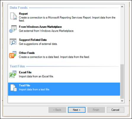
文本文件
-
微软 SQL Azure
-
甲骨文
-
Teradata
-
赛贝斯
-
Informix
-
IBM DB2
-
对象链接和嵌入数据库/开放数据库连接
- (OLEDB/ODBC) 源
-
微软 Excel 文件
-
文本文件
将数据直接加载到 PowerPivot
要将数据直接加载到 Power Pivot,请执行以下操作 –
-
打开一个新的工作簿。
-
单击功能区上的 POWERPIVOT 选项卡。
-
单击数据模型组中的管理。
PowerPivot 窗口打开。现在您有两个窗口 – Excel 工作簿窗口和连接到您的工作簿的 PowerPivot for Excel 窗口。
-
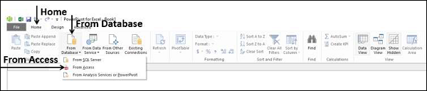
单击PowerPivot 窗口中的主页选项卡。
-
单击获取外部数据组中的从数据库。
-
选择从访问。
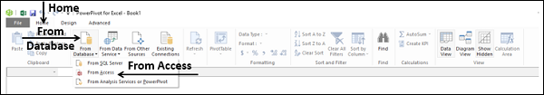
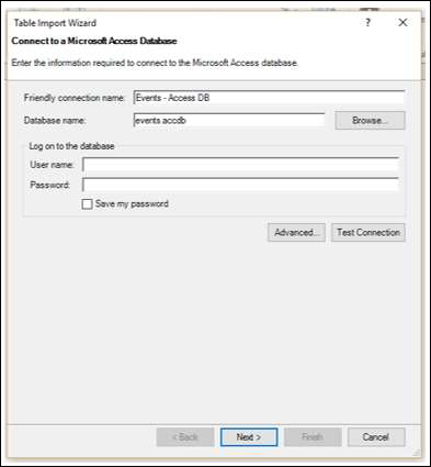
出现表导入向导。
-
浏览到 Access 数据库文件。
-
提供友好的连接名称。
-
如果数据库受密码保护,还要填写这些详细信息。
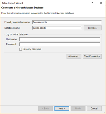
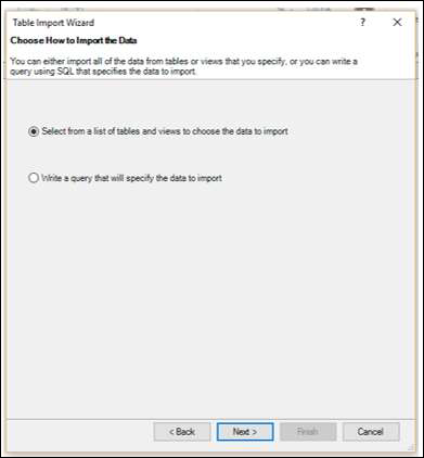
单击下一步→ 按钮。表导入向导显示用于选择如何导入数据的选项。
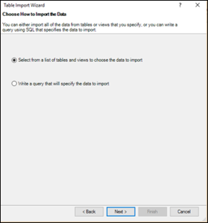
单击从表和视图列表中选择以选择要导入的数据。
单击下一步→ 按钮。表导入向导显示您选择的 Access 数据库中的表和视图。
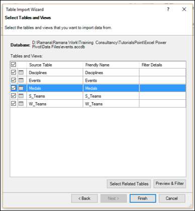
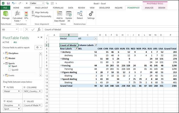
选中奖牌框。
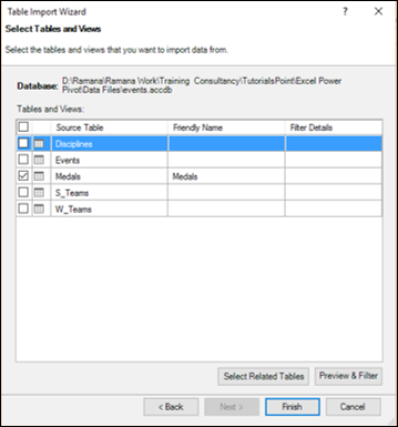
如您所见,您可以在添加到数据透视表和/或选择相关表格之前,通过选中复选框、预览和过滤表格来选择表格。
单击预览和过滤按钮。
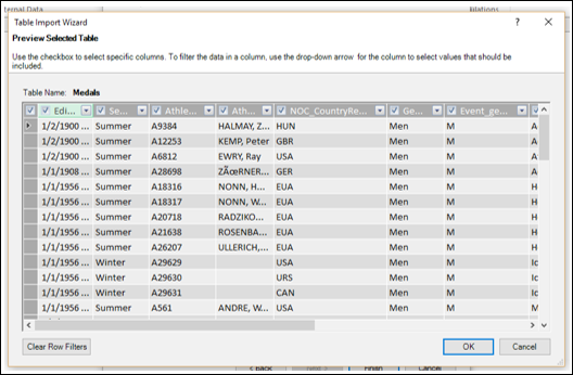
如您所见,您可以通过选中列标签中的框来选择特定列,通过单击列标签中的下拉箭头选择要包含的值来过滤列。
-
单击确定。
-
单击选择相关表按钮。
-
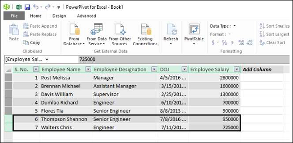
Power Pivot 检查其他哪些表与所选 Medals 表相关(如果存在关系)。
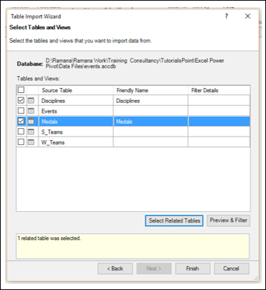
可以看到 Power Pivot 发现表 Disciplines 与表 Medals 相关并选中它。单击完成。
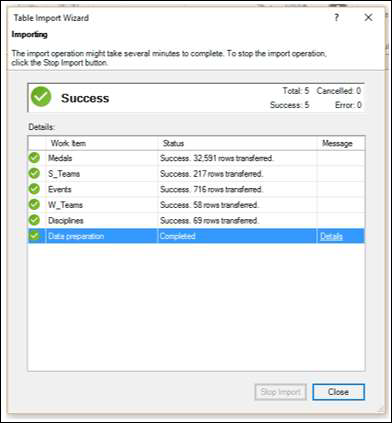
表导入向导显示 –导入并显示导入状态。这将需要几分钟,您可以通过单击停止导入按钮来停止导入。
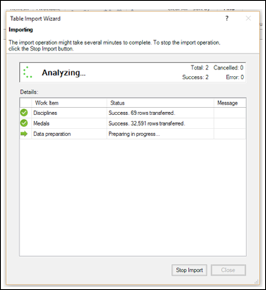
导入数据后,表导入向导将显示 –成功并显示导入结果,如下面的屏幕截图所示。单击关闭。
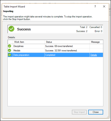
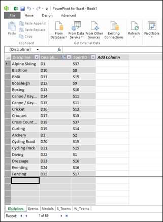
Power Pivot 在两个选项卡中显示两个导入的表。
您可以使用选项卡下方的记录箭头滚动记录(表格的行)。
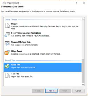
表导入向导
在上一节中,您学习了如何通过表导入向导从 Access 导入数据。
请注意,表导入向导选项根据选择要连接的数据源而变化。您可能想知道可以选择哪些数据源。
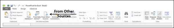
在 Power Pivot 窗口中单击来自其他源。
出现表导入向导 –连接到数据源。您可以创建与数据源的连接,也可以使用已存在的连接。
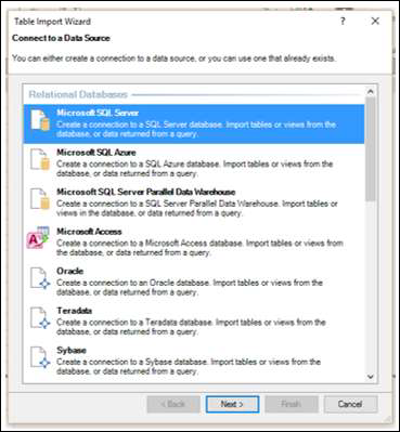
您可以在导入表向导中滚动连接列表以了解与 Power Pivot 的兼容数据连接。
-
向下滚动到文本文件。
-
选择Excel 文件。
-
单击下一步→ 按钮。表导入向导显示 – 连接到 Microsoft Excel 文件。
-
在 Excel 文件路径框中浏览到 Excel 文件。
-
选中复选框 –使用第一行作为列标题。
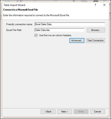
-
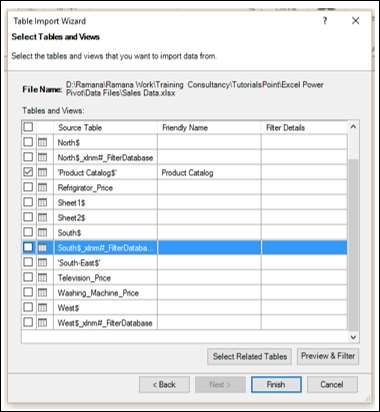
单击下一步→ 按钮。表导入向导显示 –选择表和视图。
-
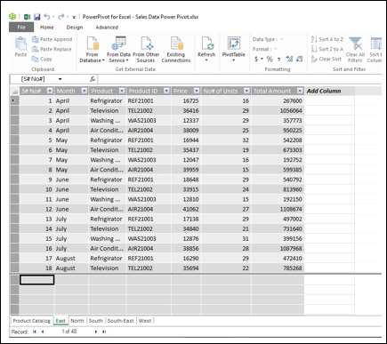
选中Product Catalog$框。单击完成按钮。
您将看到以下成功消息。单击关闭。
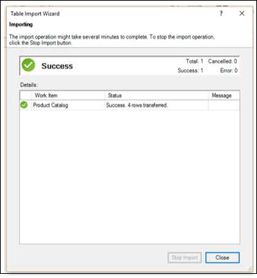
您导入了一个表,并且还创建了到包含多个其他表的 Excel 文件的连接。
打开现有连接
与数据源建立连接后,您可以稍后打开它。
单击 PowerPivot 窗口中的现有连接。
出现现有连接对话框。从列表中选择 Excel 销售数据。
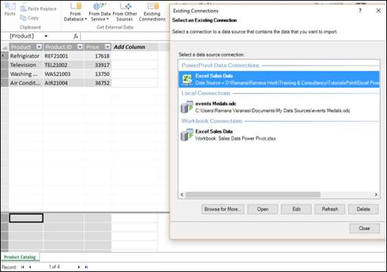
单击打开按钮。表导入向导出现,显示表和视图。
选择要导入的表并单击完成。
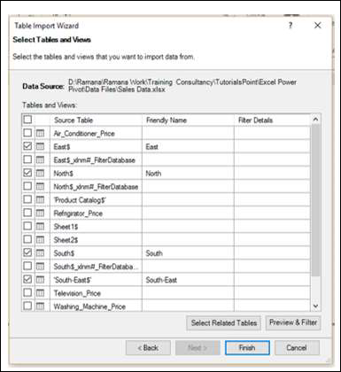
将导入所选的五个表。单击关闭。
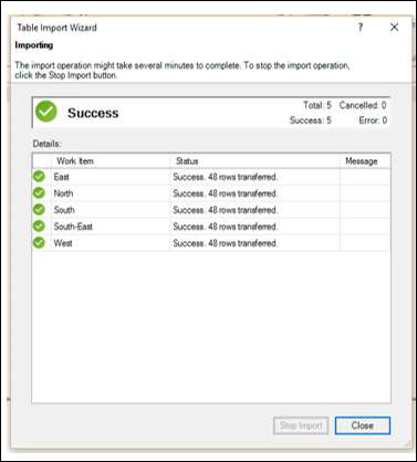
您可以看到五个表已添加到 Power Pivot,每个表都位于一个新选项卡中。
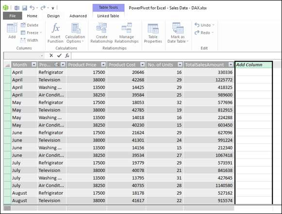
创建链接表
链接表是 Excel 中的表与数据模型中的表之间的实时链接。对 Excel 中表的更新会自动更新模型中数据表中的数据。
您可以通过以下几个步骤将 Excel 表格链接到 Power Pivot –
-
用数据创建一个 Excel 表。
-
单击功能区上的 POWERPIVOT 选项卡。
-
单击表组中的添加到数据模型。
Excel 表链接到 PowerPivot 中的相应数据表。
您可以看到带有选项卡 – 链接表的表工具已添加到 Power Pivot 窗口。如果单击转到 Excel 表格,您将切换到 Excel 工作表。如果单击管理,您将切换回 Power Pivot 窗口中的链接表。
您可以自动或手动更新链接表。
请注意,只有当 Excel 表格存在于 Power Pivot 的工作簿中时,才能链接它。如果您在单独的工作簿中有 Excel 表,则必须按照下一节中的说明加载它们。
从 Excel 文件加载
如果要从 Excel 工作簿加载数据,请记住以下几点 –
-
Power Pivot 将其他 Excel 工作簿视为数据库,并且仅导入工作表。
-
Power Pivot 将每个工作表加载为表格。
-
Power Pivot 无法识别单个表。因此,Power Pivot 无法识别工作表上是否有多个表。
-
除了工作表上的表格,Power Pivot 无法识别任何其他信息。
因此,将每个表保存在单独的工作表中。
工作簿中的数据准备好后,您可以按如下方式导入数据 –
-
在 Power Pivot 窗口的获取外部数据组中单击来自其他源。
-
按照部分中的说明进行操作 – 表导入向导。
以下是链接的 Excel 表和导入的 Excel 表之间的区别 –
-
链接表需要位于存储 Power Pivot 数据库的同一个 Excel 工作簿中。如果数据已存在于其他 Excel 工作簿中,则使用此功能没有意义。
-
Excel 导入功能允许您从不同的 Excel 工作簿加载数据。
-
从 Excel 工作簿加载数据不会在两个文件之间创建链接。Power Pivot 在导入时仅创建数据的副本。
-
当原始 Excel 文件更新时,Power Pivot 中的数据不会刷新。您需要在 Power Pivot 窗口的链接表选项卡中将更新模式设置为自动或手动更新数据。
从文本文件加载
流行的数据表示样式之一是使用称为逗号分隔值 (csv) 的格式。每个数据行/记录由一个文本行表示,其中列/字段用逗号分隔。许多数据库提供了保存为 csv 格式文件的选项。
如果要将 csv 文件加载到 Power Pivot,则必须使用“文本文件”选项。假设您有以下 csv 格式的文本文件 –
-
单击 PowerPivot 选项卡。
-
单击 PowerPivot 窗口中的主页选项卡。
-
单击获取外部数据组中的来自其他源。出现表导入向导。
-
向下滚动到文本文件。
-
单击文本文件。
-
单击下一步→ 按钮。表导入向导与显示器一起出现 – 连接到平面文件。
-
浏览到文件路径框中的文本文件。csv 文件的第一行通常表示列标题。
-
如果第一行有标题,请选中使用第一行作为列标题框。
-
在列分隔符框中,默认为逗号 (,),但如果您的文本文件有任何其他运算符,例如制表符、分号、空格、冒号或竖线,则选择该运算符。
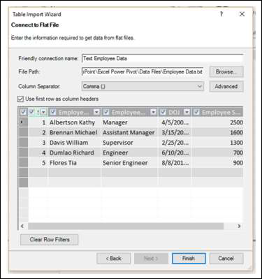
如您所见,您可以预览数据表。单击完成。
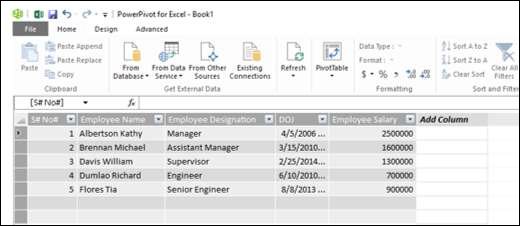
Power Pivot 在数据模型中创建数据表。
从剪贴板加载
假设您的应用程序中的数据未被 Power Pivot 识别为数据源。要将这些数据加载到 Power Pivot,您有两个选择 –
-
将数据复制到 Excel 文件并使用 Excel 文件作为 Power Pivot 的数据源。
-
复制数据,使其位于剪贴板上,然后将其粘贴到 Power Pivot 中。
您已经在前面的部分中学习了第一个选项。这比第二个选项更可取,您将在本节末尾找到。但是,您应该知道如何将数据从剪贴板复制到 Power Pivot。
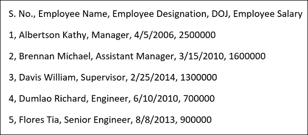
假设您在 word 文档中有如下数据 –
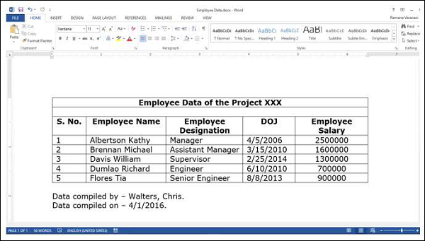
Word 不是 Power Pivot 的数据源。因此,执行以下操作 –
-
在 Word 文档中选择表格。
-
将其复制并粘贴到 PowerPivot 窗口中。
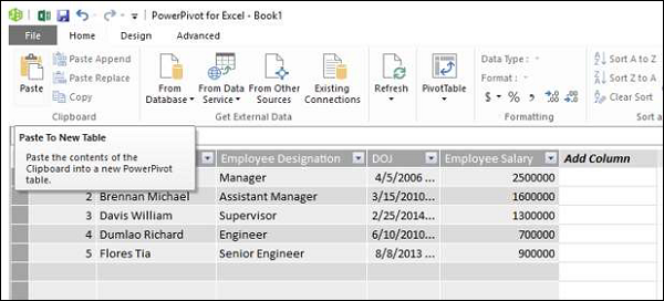
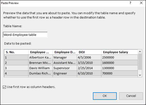
该预览粘贴对话框出现。
-
将名称命名为Word-Employee table。
-
选中“使用第一行作为列标题”框,然后单击“确定”。
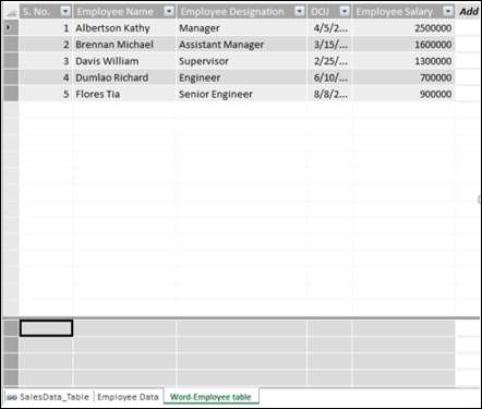
复制到剪贴板的数据将粘贴到 Power Pivot 中的新数据表中,标签为 – Word-Employee 表。
假设您想用新内容替换此表。
-
从 Word 复制表格。
-
单击粘贴替换。
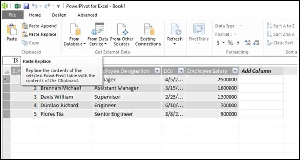
出现粘贴预览对话框。验证您用于替换的内容。
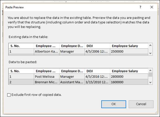
单击确定。
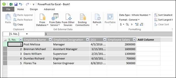
如您所见,Power Pivot 中数据表的内容已替换为剪贴板中的内容。
假设您要向数据表中添加两行新数据。在 Word 文档的表格中,您有两个新闻行。
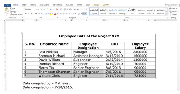
-
选择两个新行。
-
单击复制。
-
在 Power Pivot 窗口中单击粘贴追加。出现粘贴预览对话框。
-
验证您用于追加的内容。
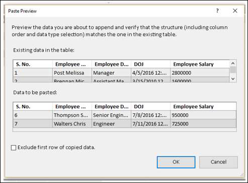
单击“确定”继续。
如您所见,Power Pivot 中数据表的内容附加到剪贴板中的内容。
在本节的开头,我们已经说过将数据复制到 Excel 文件并使用链接表比从剪贴板复制更好。
这是因为以下原因 –
-
如果您使用链接表,您就知道数据的来源。另一方面,您以后将不知道数据的来源或是否被其他人使用。
-
您在 Word 文件中有跟踪信息,例如何时替换数据以及何时附加数据。但是,无法将该信息复制到 Power Pivot。如果您先将数据复制到 Excel 文件,则可以保留该信息以备后用。
-
从剪贴板复制时,如果要添加一些注释,则不能这样做。如果先复制到 Excel 文件,则可以在将链接到 Power Pivot 的 Excel 表中插入注释。
-
无法刷新从剪贴板复制的数据。如果数据来自链接表,您可以始终确保数据已更新。
在 Power Pivot 中刷新数据
您可以随时刷新从外部数据源导入的数据。
如果您只想刷新 Power Pivot 中的一个数据表,请执行以下操作 –
-
单击数据表的选项卡。
-
单击刷新。
-
从下拉列表中选择刷新。
如果要刷新 Power Pivot 中的所有数据表,请执行以下操作 –
-
单击刷新按钮。
-
从下拉列表中选择全部刷新。
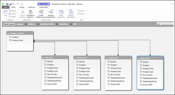
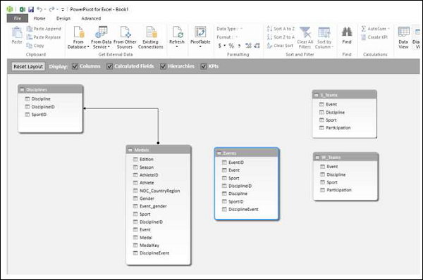
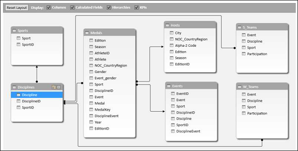
Excel Power Pivot – 数据模型
数据模型是 Excel 2013 中引入的一种新方法,用于集成来自多个表的数据,有效地在 Excel 工作簿中构建关系数据源。在 Excel 中,数据模型被透明地使用,提供在数据透视表和数据透视图中使用的表格数据。在 Excel 中,您可以通过包含表名称和对应字段的数据透视表/数据透视图字段列表访问表及其对应的值。
Excel 中数据模型的主要用途是 Power Pivot 的使用。数据模型可以看作是 Power Pivot 数据库,Power Pivot 的所有强大功能都通过数据模型进行管理。Power Pivot 的所有数据操作本质上都是显式的,并且可以在数据模型中进行可视化。
在本章中,您将详细了解数据模型。
Excel 和数据模型
Excel 工作簿中将只有一个数据模型。当您使用 Excel 时,数据模型的使用是隐式的。您不能直接访问数据模型。您只能在数据透视表或数据透视图的字段列表中查看数据模型中的多个表并使用它们。创建数据模型和添加数据也在 Excel 中隐式完成,同时您将外部数据导入 Excel。
如果你想查看数据模型,你可以这样做 –
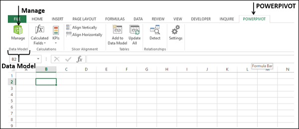
-
单击功能区上的 POWERPIVOT 选项卡。
-
单击管理。
数据模型(如果工作簿中存在)将显示为表格,每个表格都有一个选项卡。
注意– 如果将 Excel 表添加到数据模型,则不会将 Excel 表转换为数据表。Excel 表的副本添加为数据模型中的数据表,并在两者之间创建链接。因此,如果在 Excel 表中进行了更改,数据表也会更新。但是,从存储的角度来看,有两个表。
Power Pivot 和数据模型
数据模型本质上是 Power Pivot 的数据库。即使您从 Excel 创建数据模型,它也只会构建 Power Pivot 数据库。创建数据模型和/或添加数据是在 Power Pivot 中明确完成的。
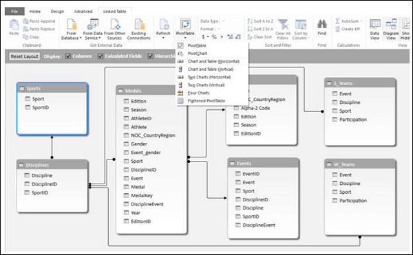
事实上,您可以从 Power Pivot 窗口管理数据模型。您可以向数据模型添加数据、从不同数据源导入数据、查看数据模型、创建表之间的关系、创建计算字段和计算列等。
创建数据模型
您可以将表从 Excel 添加到数据模型,也可以直接将数据导入 Power Pivot,从而创建 Power Pivot 数据模型表。您可以通过单击 Power Pivot 窗口中的管理来查看数据模型。
您将在“通过 Excel 加载数据”一章中了解如何将 Excel 中的表格添加到数据模型中。您将在章节 – 将数据加载到 Power Pivot 中了解如何将数据加载到数据模型中。
数据模型中的表
数据模型中的表可以定义为一组包含它们之间关系的表。这些关系能够组合来自不同表的相关数据以进行分析和报告。
数据模型中的表称为数据表。
数据模型中的表被认为是由字段(字段是列)组成的一组记录(记录是一行)。您不能编辑数据表中的单个项目。但是,您可以向数据表追加行或添加计算列。
Excel 表格和数据表格
Excel 表格只是单独表格的集合。一个工作表上可以有多个表。每个表都可以单独访问,但不能同时访问多个 Excel 表中的数据。这就是当您创建数据透视表时,它仅基于一个表的原因。如果需要同时使用两个 Excel 表格中的数据,则需要先将它们合并到一个 Excel 表格中。
另一方面,数据表与其他具有关系的数据表共存,便于组合来自多个表的数据。将数据导入 Power Pivot 时会创建数据表。您还可以在创建数据透视表以获取外部数据或从多个表中添加 Excel 表到数据模型。
数据模型中的数据表可以通过两种方式查看 –
-
数据视图。
-
图表视图。
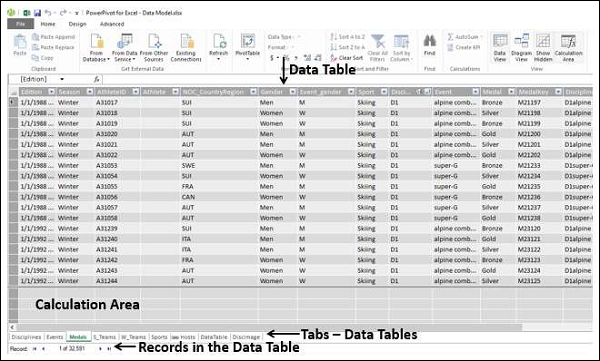
数据模型的数据视图
在数据模型的数据视图中,每个数据表都存在于单独的选项卡上。数据表的行是记录,列代表字段。选项卡包含表名,列标题是该表中的字段。您可以使用数据分析表达式 (DAX) 语言在数据视图中进行计算。
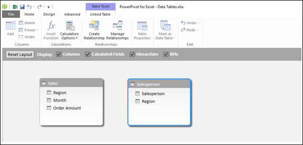
数据模型的图表视图
在数据模型的图表视图中,所有数据表都由带有表名称的框表示,并包含表中的字段。您只需拖动表格即可在图表视图中排列表格。您可以调整数据表的大小,以便显示表中的所有字段。

数据模型中的关系
您可以在图表视图中查看关系。如果两个表之间定义了关系,则会出现一个将源表连接到目标表的箭头。如果您想知道关系中使用了哪些字段,只需双击箭头即可。两个表中的箭头和两个字段突出显示。
如果您导入具有主键和外键关系的相关表,将自动创建表关系。Excel 可以使用导入的关系信息作为数据模型中表格关系的基础。
您还可以在两个视图中的任何一个中明确创建关系 –
-
数据视图– 使用创建关系对话框。
-
图表视图– 通过单击并拖动连接两个表。
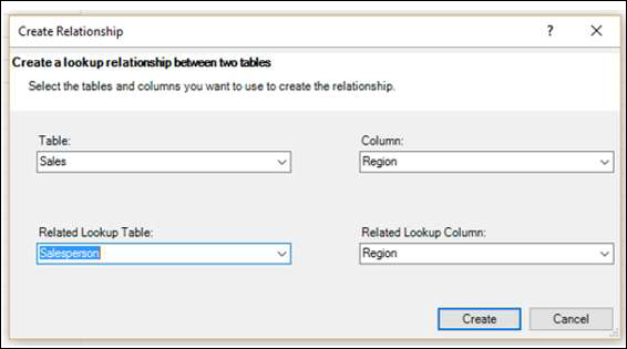
创建关系对话框
在关系中,涉及四个实体 –
-
表– 关系开始的数据表。
-
列– 表中的字段也存在于相关表中。
-
相关表– 关系结束的数据表。
-
相关列– 相关表中的字段与表中的列表示的字段相同。请注意,相关列的值应该是唯一的。
在图表视图中,您可以通过单击表中的字段并拖动到相关表来创建关系。
您将在章节 – 使用 Power Pivot 管理数据表和关系中了解有关关系的更多信息。
Excel Power Pivot – 管理数据模型
Power Pivot 的主要用途是它能够管理数据表及其之间的关系,以便于分析多个表中的数据。您可以在创建数据透视表时或直接从 PowerPivot 功能区向数据模型添加 excel 表。
只有当多个表之间存在关系时,您才能分析来自多个表的数据。使用 Power Pivot,您可以从数据视图或图表视图创建关系。此外,如果您已选择向 Power Pivot 添加表,则还需要添加关系。
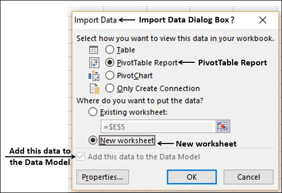
使用数据透视表将 Excel 表格添加到数据模型
在 Excel 中创建数据透视表时,它仅基于单个表/区域。如果您想向数据透视表添加更多表,您可以使用数据模型来实现。
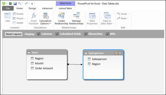
假设您的工作簿中有两个工作表 –
-
一个包含销售人员及其代表的区域的数据,在表中 – 销售人员。
-
另一个包含销售、地区和月份数据的表格 – 销售。
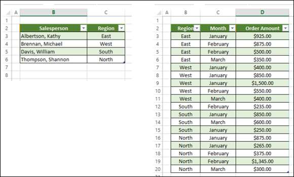
您可以总结销售人员的销售情况,如下所示。
-
单击表 – 销售。
-
单击功能区上的插入选项卡。
-
在表格组中选择数据透视表。
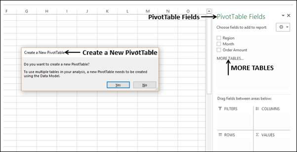
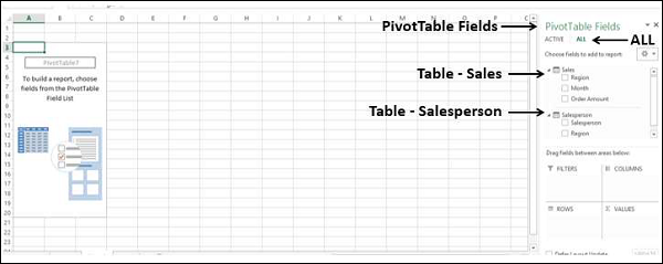
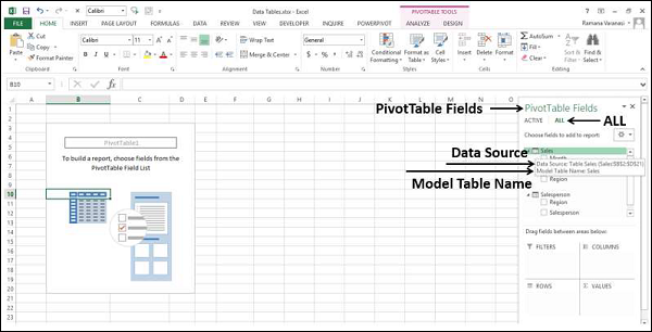
将创建一个空数据透视表,其中包含 Sales 表中的字段 – Region、Month 和 Order Amount。如您所见,数据透视表字段列表下方有一个MORE TABLES命令。
-
单击更多表格。
出现创建新数据透视表消息框。显示的消息是 – 要在分析中使用多个表,需要使用数据模型创建一个新的数据透视表。单击是
将创建一个新的数据透视表,如下所示 –
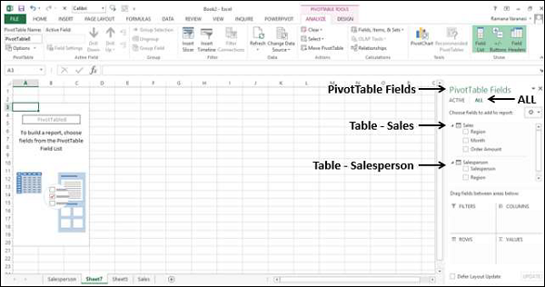
在数据透视表字段下,您可以观察到有两个选项卡 – ACTIVE和ALL。
-
单击全部选项卡。
-
两个表 – Sales 和 Salesperson,相应的字段出现在数据透视表字段列表中。
-
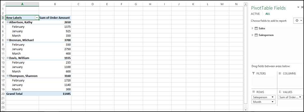
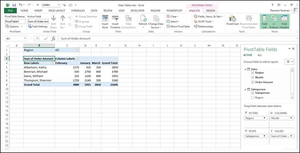
单击 Salesperson 表中的字段 Salesperson 并将其拖到 ROWS 区域。
-
单击 Sales 表中的字段 Month 并将其拖到 ROWS 区域。
-
单击 Sales 表中的字段 Order Amount 并将其拖到 ∑ VALUES 区域。
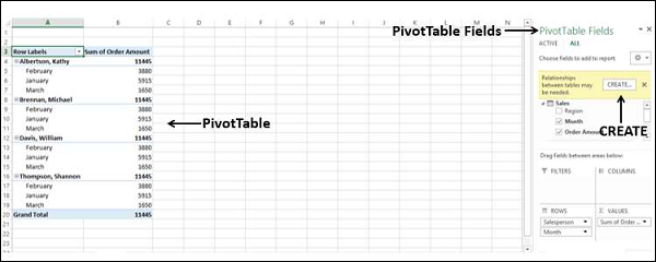
数据透视表已创建。数据透视表字段中会出现一条消息 –可能需要表之间的关系。
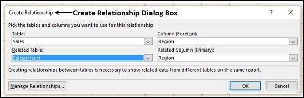
单击消息旁边的 CREATE 按钮。在创建关系对话框出现。

-
在表下,选择销售。
-
在列(外部)框下,选择区域。
-
在“相关表”下,选择“销售员”。
-
在相关列(主要)框下,选择区域。
-
单击确定。
两个工作表上的两个表中的数据透视表已准备就绪。
此外,正如 Excel 在将第二个表添加到数据透视表时所说的那样,数据透视表是使用数据模型创建的。要验证,请执行以下操作 –
-
单击功能区上的 POWERPIVOT 选项卡。
-
单击数据模型组中的管理。Power Pivot 的数据视图出现。
您可以观察到您在创建数据透视表时使用的两个 Excel 表已转换为数据模型中的数据表。
将不同工作簿中的 Excel 表添加到数据模型
假设两个表 – Salesperson 和 Sales 位于两个不同的工作簿中。
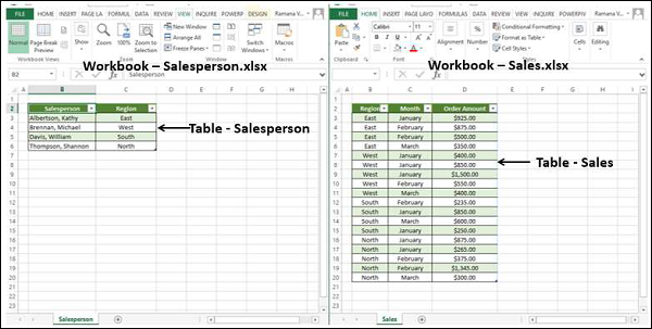
您可以将不同工作簿中的 Excel 表添加到数据模型中,如下所示 –
-
单击销售表。
-
单击插入选项卡。
-
单击表组中的数据透视表。在创建数据透视表对话框出现。

-
在“表/范围”框中,键入 Sales。
-
单击新建工作表。
-
选中将这个数据添加到数据模型框。
-
单击确定。
您将在新工作表上获得一个空数据透视表,其中只有与 Sales 表对应的字段。
您已将 Sales 表数据添加到数据模型。接下来,您必须将 Salesperson 表数据也放入数据模型中,如下所示 –
-
单击包含 Sales 表的工作表。
-
单击功能区上的数据选项卡。
-
单击获取外部数据组中的现有连接。出现现有连接对话框。
-
单击表选项卡。
在此工作簿数据模型下,显示1 个表(这是您之前添加的 Sales 表)。您还可以找到显示其中表格的两个工作簿。
-
单击 Salesperson.xlsx 下的 Salesperson。
-
单击打开。在导入数据对话框。
-
单击数据透视表报告。
-
单击新建工作表。
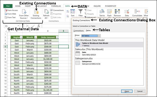
您可以看到复选框 –将此数据添加到数据模型已选中且处于非活动状态。单击确定。
将创建数据透视表。
正如您所看到的,这两个表都在数据模型中。您可能需要像上一节一样在两个表之间创建关系。
从 PowerPivot 功能区向数据模型添加 Excel 表
将 Excel 表添加到数据模型的另一种方法是从 PowerPivot Ribbon 中执行此操作。
假设您的工作簿中有两个工作表 –
-
一个包含销售人员及其代表的区域的数据的表格 – 销售人员。
-
另一个包含销售、地区和月份数据的表格 – 销售。

您可以先将这些 Excel 表添加到数据模型中,然后再进行任何分析。
-
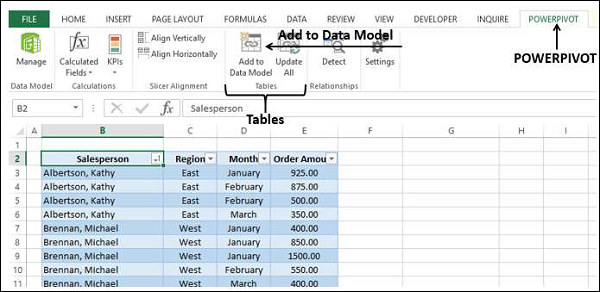
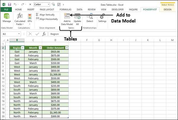
单击 Excel 表 – 销售。
-
单击功能区上的 POWERPIVOT 选项卡。
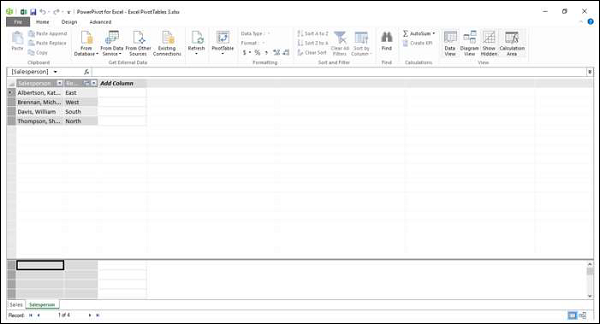
-
单击表组中的添加到数据模型。
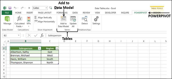
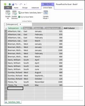
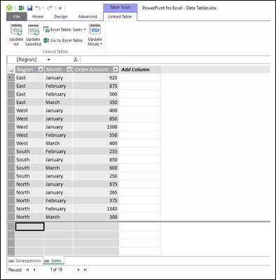
出现 Power Pivot 窗口,其中添加了数据表 Salesperson。还有一个选项卡 – 链接表出现在 Power Pivot 窗口的功能区上。
-
单击功能区上的链接表选项卡。
-
单击 Excel 表:销售人员。
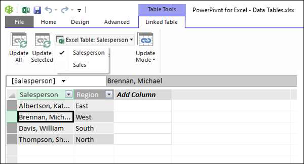
您会发现工作簿中显示了两个表的名称,并勾选了名称 Salesperson。这意味着数据表 Salesperson 链接到 Excel 表 Salesperson。
单击转到 Excel 表格。
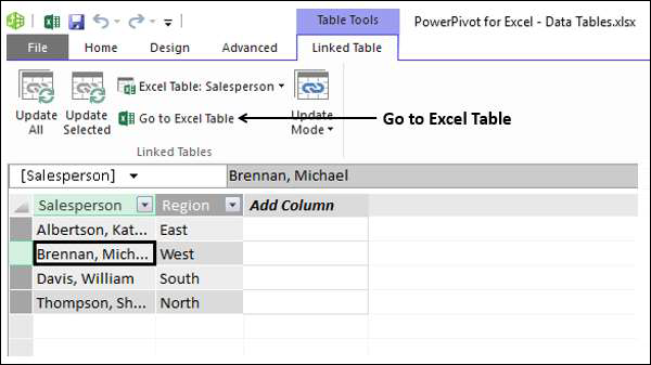
显示包含销售员表的工作表的 Excel 窗口。
-
单击销售工作表选项卡。
-
单击销售表。
-
单击功能区上表组中的添加到数据模型。
Excel 表 Sales 也被添加到数据模型中。
如果要基于这两个表进行分析,如您所知,您需要在两个数据表之间创建关系。在 Power Pivot 中,您可以通过两种方式执行此操作 –
-
从数据视图
-
从图表视图
从数据视图创建关系
如您所知,在数据视图中,您可以查看记录为行、字段为列的数据表。
-
单击 Power Pivot 窗口中的设计选项卡。
-
单击关系组中的创建关系。在创建关系对话框出现。
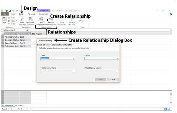
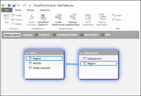
-
单击表框中的销售额。这是关系开始的表。如您所知,Column 应该是包含唯一值的相关表 Salesperson 中存在的字段。
-
单击列框中的区域。
-
单击相关链接表框中的销售人员。
相关链接列会自动填充区域。
单击创建按钮。关系已创建。
从图表视图创建关系
从图表视图创建关系相对容易。按照给定的步骤操作。
-
单击 Power Pivot 窗口中的主页选项卡。
-
单击视图组中的图表视图。
数据模型的图表视图出现在 Power Pivot 窗口中。
-
单击 Sales 表中的 Region。Sales 表中的 Region 突出显示。
-
拖动到 Salesperson 表中的 Region。Salesperson 表中的 Region 也突出显示。一条线出现在您拖动的方向。
-
从表 Sales 到表 Salesperson 出现一条线,指示关系。
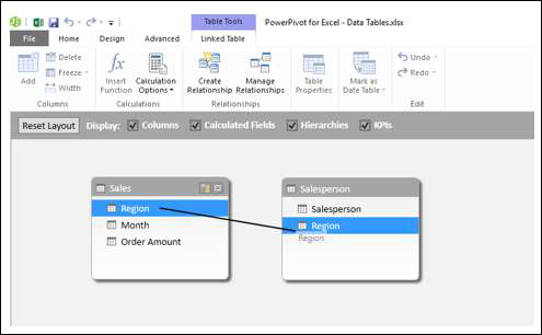
如您所见,从 Sales 表到 Salesperson 表出现一条线,表示关系和方向。
如果您想知道属于关系一部分的字段,请单击关系线。两个表中的行和字段都突出显示。
管理关系
您可以编辑或删除数据模型中的现有关系。
-
单击 Power Pivot 窗口中的设计选项卡。
-
单击关系组中的管理关系。出现“管理关系”对话框。
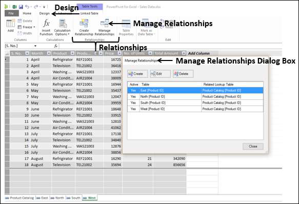
显示数据模型中存在的所有关系。
编辑关系
-
单击关系。
-
单击编辑按钮。在编辑关系对话框。
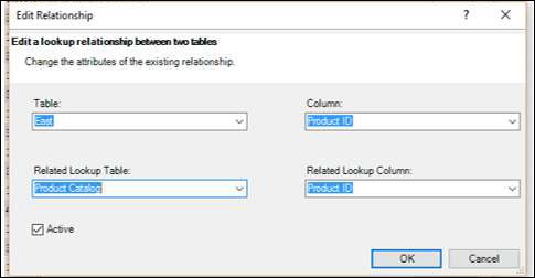
-
对关系进行必要的更改。
-
单击确定。这些变化反映在关系中。
删除关系
-
单击关系。
-
单击删除按钮。将出现一条警告消息,显示受删除关系影响的表将如何影响报告。
-
如果您确定要删除,请单击“确定”。选定的关系被删除。
刷新 Power Pivot 数据
假设您修改了 Excel 表格中的数据。您可以添加/更改/删除 Excel 表格中的数据。
要刷新 PowerPivot 数据,请执行以下操作 –
-
单击 Power Pivot 窗口中的链接表选项卡。
-
单击全部更新。
数据表随着在 Excel 表中所做的修改而更新。
如您所见,您无法直接修改数据表中的数据。因此,最好在将数据添加到数据模型时将数据保存在链接到数据表的 Excel 表中。这有助于在更新 Excel 表中的数据时更新数据表中的数据。
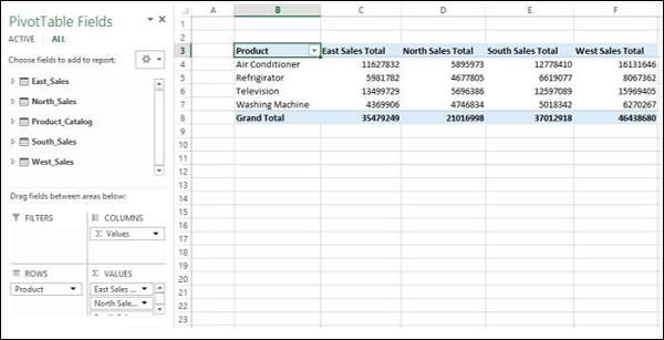
Excel Power 数据透视表 – 创建
Power PivotTable 基于 Power Pivot 数据库,称为数据模型。您已经了解了数据模型的强大功能。Power Pivot 的强大之处在于它能够在 Power PivotTable 中汇总来自数据模型的数据。如您所知,数据模型可以处理跨越数百万行并来自不同输入的海量数据。这使 Power PivotTable 能够在几分钟内汇总来自任何地方的数据。
Power PivotTable 的布局类似于 PivotTable,但有以下区别 –
-
数据透视表基于 Excel 表,而 Power 数据透视表基于作为数据模型一部分的数据表。
-
数据透视表基于单个 Excel 表或数据范围,而 Power PivotTable 可以基于多个数据表,前提是将它们添加到数据模型中。
-
数据透视表是从 Excel 窗口创建的,而 Power PivotTable 是从 PowerPivot 窗口创建的。
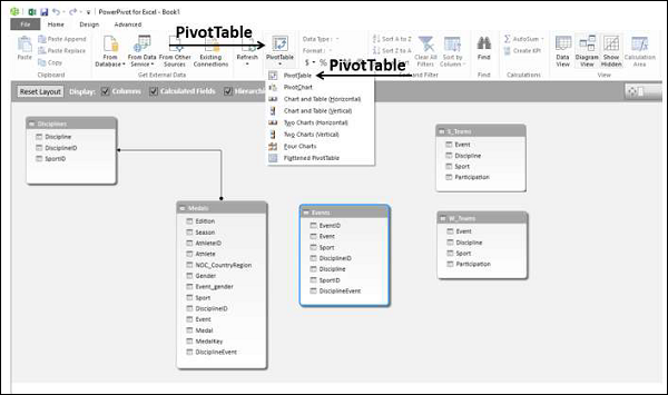
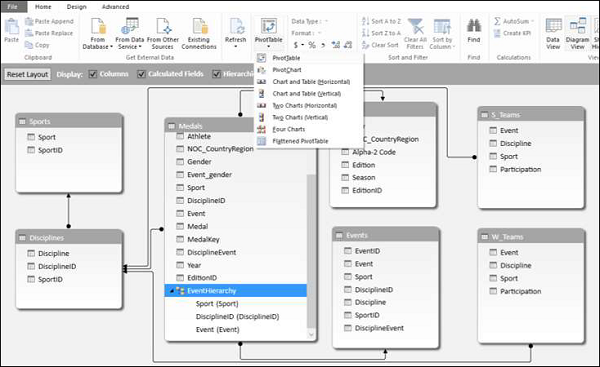
创建 Power 数据透视表
假设您有两个数据表 – 数据模型中的 Salesperson 和 Sales。要从这两个数据表创建 PowerPivot 表,请按以下步骤操作 –
-
单击 PowerPivot 窗口中功能区上的主页选项卡。
-
单击功能区上的数据透视表。
-
从下拉列表中选择数据透视表。
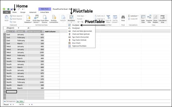
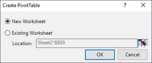
出现创建数据透视表对话框。如您所见,这是一个简单的对话框,没有对数据进行任何查询。这是因为,Power PivotTable 始终基于数据模型,即数据表之间定义了关系。
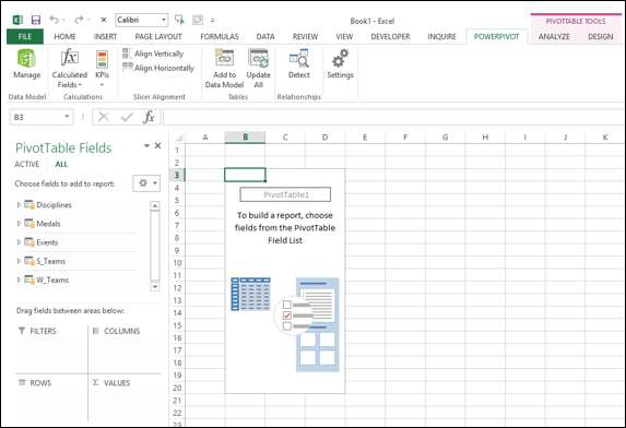
选择新建工作表,然后单击确定。
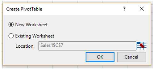
在 Excel 窗口中创建一个新工作表,并出现一个空的数据透视表。
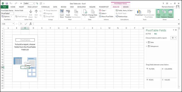
如您所见,Power PivotTable 的布局与 PivotTable 的布局相似。的透视TOOLS显示在功能区,具有ANALYZE和设计标签,相同数据透视表。
数据透视表字段列表出现在工作表的右侧。在这里,您会发现与数据透视表的一些不同之处。
Power 数据透视表字段
数据透视表字段列表有两个选项卡 – ACTIVE 和 ALL 出现在标题下方和字段列表上方。该ALL选项卡被高亮显示。
请注意,ALL选项卡显示数据模型中的所有数据表,ACTIVE 选项卡显示为手头的 Power PivotTable 选择的所有数据表。由于 Power PivotTable 为空,表示尚未选择任何数据表;因此默认情况下,ALL 选项卡被选中并显示当前在数据模型中的两个表。此时,如果单击ACTIVE选项卡,则字段列表将为空。
-
单击 ALL 下数据透视表字段列表中的表名称。将出现带有复选框的相应字段。
-
每个表名
 的左侧都会有符号。
 -
如果将光标放在该符号上,将显示该数据表的数据源和模型表名称。
-
将 Salesperson 从 Salesperson 表拖到 ROWS 区域。
-
点击ACTIVE标签。
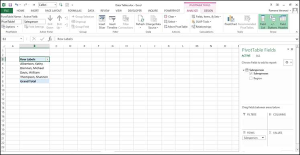
正如您所看到的,字段 Salesperson 出现在数据透视表中,并且表 Salesperson 出现在ACTIVE选项卡下,正如预期的那样。
-
单击全部选项卡。
-
单击 Sales 表中的 Month 和 Order Amount。
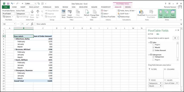
再次单击 ACTIVE 选项卡。两个表 – Sales 和 Salesperson 都出现在ACTIVE选项卡下。
-
将月份拖到 COLUMNS 区域。
-
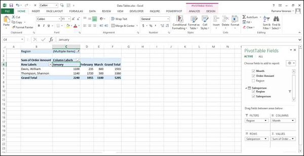
将区域拖到过滤器区域。
-
单击区域过滤器框中 ALL 旁边的箭头。
-
单击选择多个项目。
-
选择北和南,然后单击确定。
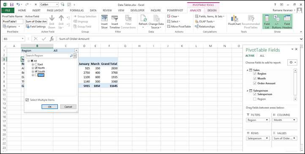
按升序对列标签进行排序。
Power PivotTable 可以动态修改,探索和报告数据。
Excel Power Pivot – DAX 基础知识
DAX(数据分析表达式)语言是 Power Pivot 的语言。Power Pivot 使用 DAX 进行数据建模,方便您用于自助服务 BI。DAX 基于数据表和数据表中的列。请注意,它不像 Excel 中的公式和函数那样基于表格中的单个单元格。
您将在本章中学习数据模型中存在的两个简单计算 – 计算列和计算字段。
计算列
计算列是数据模型中由计算定义并扩展数据表内容的列。可以将其可视化为由公式定义的 Excel 表中的新列。
使用计算列扩展数据模型
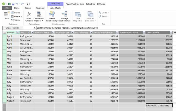
假设您在数据表中有产品区域的销售数据,在数据模型中有产品目录。
使用此数据创建 Power 数据透视表。
如您所见,Power PivotTable 汇总了所有地区的销售数据。假设您想知道每种产品的毛利润。您知道每种产品的价格、销售成本和销售单位数。
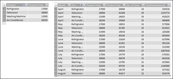
但是,如果您需要计算毛利,则需要在每个区域的数据表中多增加两列 – Total Product Price 和 Gross Profit。这是因为,数据透视表需要数据表中的列来汇总结果。
如您所知,总产品价格是产品价格 * 单位数,毛利润是总金额 – 总产品价格。
您需要使用 DAX 表达式添加计算列,如下所示 –
-
单击 Power Pivot 窗口的数据视图中的 East_Sales 选项卡以查看 East_Sales 数据表。
-
单击功能区上的设计选项卡。
-
单击添加。
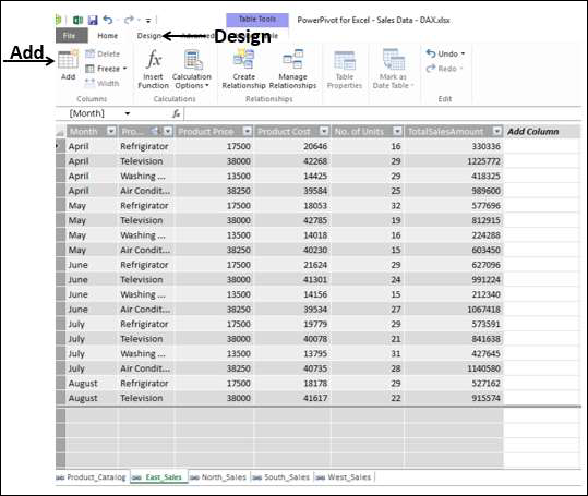
带有标题的右侧列 – 添加列突出显示。
类型 = [产品价格] * [编号 of Units]在公式栏中,然后按Enter。

将插入一个带有标题CalculatedColumn1 的新列,其中包含由您输入的公式计算出的值。
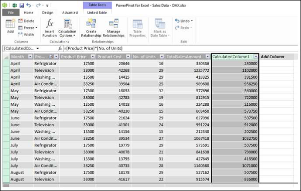
-
双击新计算列的标题。
-
将标题重命名为TotalProductPrice。
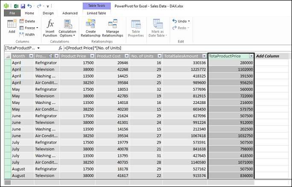
为毛利润再添加一个计算列,如下所示 –
-
单击功能区上的设计选项卡。
-
单击添加。
-
带有标题的右侧列 – 添加列突出显示。
-
在公式栏中输入= [TotalSalesAmount] – [TotaProductPrice]。
-
按 Enter。
将插入一个带有标题CalculatedColumn1 的新列,其中包含由您输入的公式计算出的值。
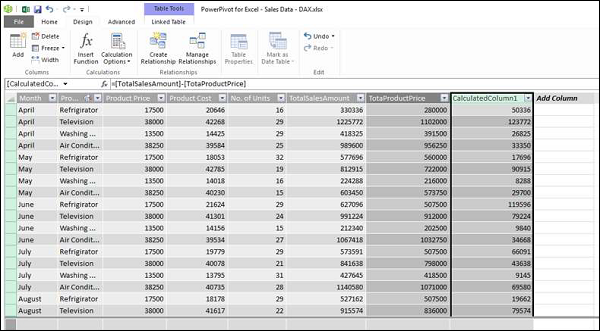
-
双击新计算列的标题。
-
将标题重命名为 Gross Profit。
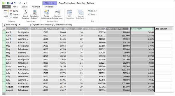
以类似的方式在North_Sales数据表中添加计算列。合并所有步骤,按以下步骤进行 –
-
单击功能区上的设计选项卡。
-
单击添加。带有标题的右侧列 – 添加列突出显示。
-
类型 = [产品价格] * [编号 单位]在公式栏中,然后按 Enter。
-
将插入带有标题 CalculatedColumn1 的新列,其中包含由您输入的公式计算出的值。
-
双击新计算列的标题。
-
将标题重命名为TotalProductPrice。
-
单击功能区上的设计选项卡。
-
单击添加。带有标题的右侧列 – 添加列突出显示。
-
在公式栏中键入 = [TotalSalesAmount] – [TotaProductPrice],然后按 Enter。将插入带有标题CalculatedColumn1 的新列,其中包含由您输入的公式计算出的值。
-
双击新计算列的标题。
-
将标题重命名为Gross Profit。
对 South Sales 数据表和 West Sales 数据表重复上述步骤。
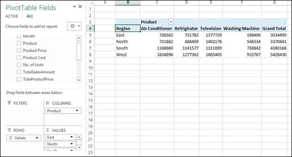
您有必要的列来汇总毛利润。现在,创建 Power 数据透视表。
您可以使用 Power Pivot 中的计算列总结可能产生的毛利润,并且这一切都可以通过几个没有错误的步骤完成。
您也可以按区域对产品进行总结,如下所示 –
计算字段
假设您要计算每个地区产品的利润百分比。您可以通过向数据表添加计算字段来实现。
-
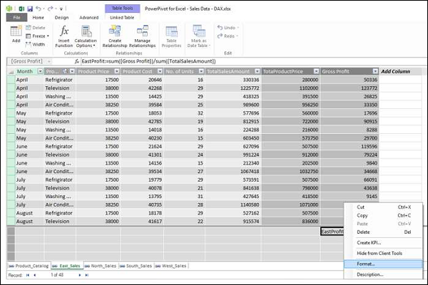
在 Power Pivot 窗口的East_Sales表中单击 Gross Profit 列下方。
-
类型EastProfit:= SUM([毛利])/ SUM([TotalSalesAmount])在公式栏中。
-
按 Enter。
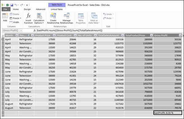
计算字段 EastProfit 插入到 Gross Profit 列下方。
-
右键单击计算字段 – EastProfit。
-
从下拉列表中选择格式。
出现格式对话框。
-
选择类别下的数字。
-
在格式框中,选择百分比,然后单击确定。
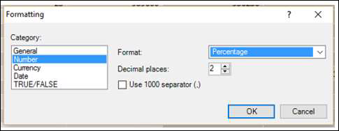
计算字段 EastProfit 的格式设置为百分比。
重复步骤以插入以下计算字段 –
-
North_Sales 数据表中的 NorthProfit。
-
South_Sales 数据表中的 SouthProfit。
-
West_Sales 数据表中的 WestProfit。
注意– 您不能使用给定名称定义多个计算字段。
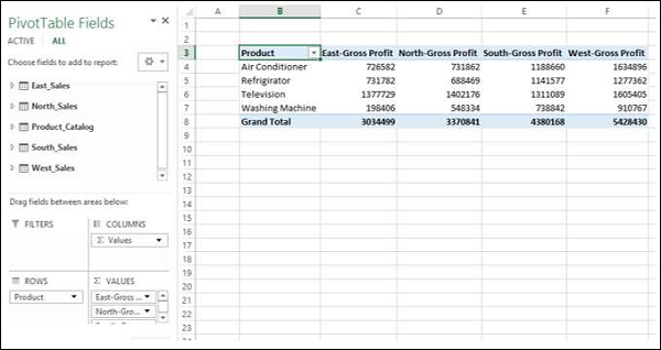
单击 Power 数据透视表。您可以看到计算字段出现在表格中。
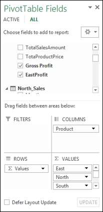
-
从数据透视表字段列表中的表中选择字段 – EastProfit、NorthProfit、SouthProfit 和 WestProfit。
-
排列字段,使毛利润和利润百分比一起出现。Power PivotTable 如下所示 –
注意–计算字段在早期版本的 Excel中称为度量。
Excel Power Pivot – 探索数据
在前一章中,您学习了如何从一组普通数据表创建 Power PivotTable。在本章中,当数据表包含数千行时,您将了解如何使用 Power PivotTable 探索数据。
为了更好地理解,我们将从 access 数据库中导入数据,您知道它是一个关系数据库。
从 Access 数据库加载数据
要从 Access 数据库加载数据,请按照给定的步骤操作 –
-
在 Excel 中打开一个新的空白工作簿。
-
单击数据模型组中的管理。
-
单击功能区上的 POWERPIVOT 选项卡。
出现 Power Pivot 窗口。
-
单击 Power Pivot 窗口中的主页选项卡。
-
单击获取外部数据组中的从数据库。
-
从下拉列表中选择从访问。
出现表导入向导。
-
提供友好的连接名称。
-
浏览到 Access 数据库文件 Events.accdb,即事件数据库文件。
-
单击下一步 > 按钮。
该表导入向导显示选项选择如何导入数据。
单击从表和视图列表中选择以选择要导入的数据,然后单击下一步。
该表导入向导显示所有在Access数据库中的表您选择。选中所有框以选择所有表,然后单击完成。
该表导入向导显示-导入并显示导入的状态。这可能需要几分钟时间,您可以通过单击停止导入按钮来停止导入。
数据导入完成后,表导入向导会显示 –成功并显示导入结果。单击关闭。
Power Pivot 在数据视图的不同选项卡中显示所有导入的表。
单击图表视图。
您可以观察到表之间存在关系 – Disciplines 和 Medals。这是因为,当您从关系数据库(如 Access)导入数据时,数据库中存在的关系也会导入到 Power Pivot 中的数据模型中。
从数据模型创建数据透视表
使用您在上一节中导入的表创建数据透视表,如下所示 –
-
单击功能区上的数据透视表。
-
从下拉列表中选择数据透视表。
-
在出现的“创建数据透视表”对话框中选择“新建工作表”,然后单击“确定”。
在 Excel 窗口的新工作表中创建一个空的数据透视表。
作为 Power Pivot 数据模型一部分的所有导入表都出现在“数据透视表字段”列表中。
-
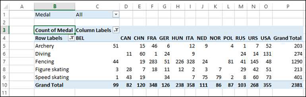
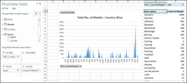
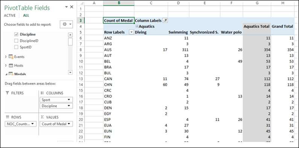
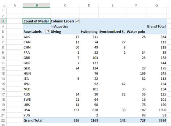
将Medals 表中的NOC_CountryRegion字段拖到COLUMNS 区域。
-
将 Discipline 从 Disciplines 表拖到 ROWS 区域。
-
筛选学科以仅显示五种运动:射箭、跳水、击剑、花样滑冰和速度滑冰。这可以在数据透视表字段区域中完成,也可以从数据透视表本身的行标签过滤器中完成。
-
将 Medal 从 Medals 表拖到 VALUES 区域。
-
再次从 Medals 表中选择 Medal 并将其拖到 FILTERS 区域。
数据透视表填充有添加的字段和区域中选择的布局。

使用数据透视表探索数据
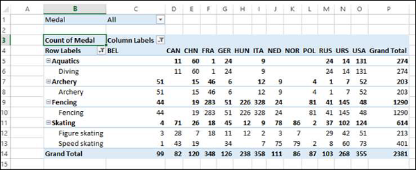
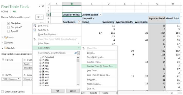
您可能只想显示 Medal Count > 80 的值。要执行此操作,请按照给定的步骤操作 –
-
单击列标签右侧的箭头。
-
从下拉列表中选择值过滤器。
-
选择大于…。从第二个下拉列表。
-
单击确定。
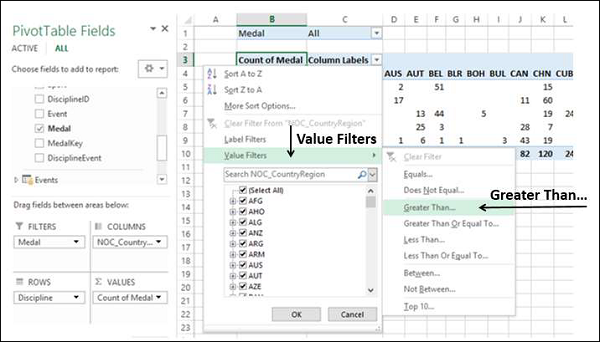
该值过滤器对话框。在最右侧的框中键入 80,然后单击“确定”。
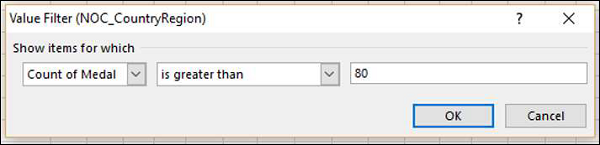
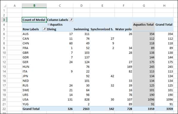
数据透视表仅显示奖牌总数超过 80 的地区。
只需几步,您就可以从不同的表格中获得您想要的特定报告。由于 Access 数据库中表之间的预先存在关系,这成为可能。当您同时从数据库中导入所有表时,Power Pivot 在其数据模型中重新创建了关系。
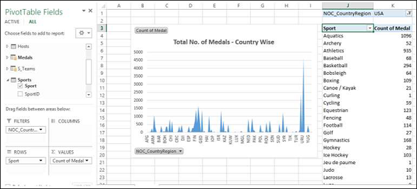
在 Power Pivot 中汇总来自不同来源的数据
如果您从不同来源获取数据表,或者如果您没有同时从数据库中导入表,或者如果您在工作簿中创建新的 Excel 表并将它们添加到数据模型中,则必须创建之间的关系要用于数据透视表中的分析和汇总的表。
-
在工作簿中创建一个新工作表。
-
创建一个 Excel 表格——体育。
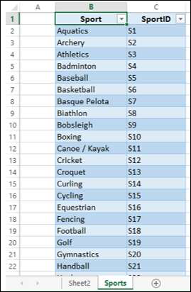
将 Sports 表添加到数据模型。
使用字段SportID在Disciplines 和 Sports表之间创建关系。

将字段Sport添加到数据透视表。
洗牌领域 – ROWS 区域中的纪律和体育。
扩展数据探索
您也可以将表Events用于进一步的数据探索。
使用字段DisciplineEvent在表Events和Medals之间创建关系。

将表Hosts添加到工作簿和数据模型。
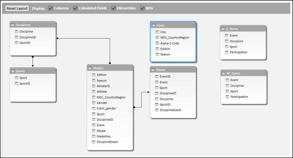
使用计算列扩展数据模型
要将 Hosts 表连接到任何其他表,它应该有一个字段,其中的值唯一标识 Hosts 表中的每一行。由于 Host 表中不存在此类字段,您可以在 Hosts 表中创建一个计算列,使其包含唯一值。
-
转到 PowerPivot 窗口的数据视图中的主机表。
-
单击功能区上的设计选项卡。
-
单击添加。
标题为“添加列”的最右侧列突出显示。

-
在公式栏中键入以下 DAX 公式 = CONCATENATE ([Edition], [Season])
-
按 Enter。
将创建一个带有标题CalculatedColumn1 的新列,该列由上述 DAX 公式产生的值填充。
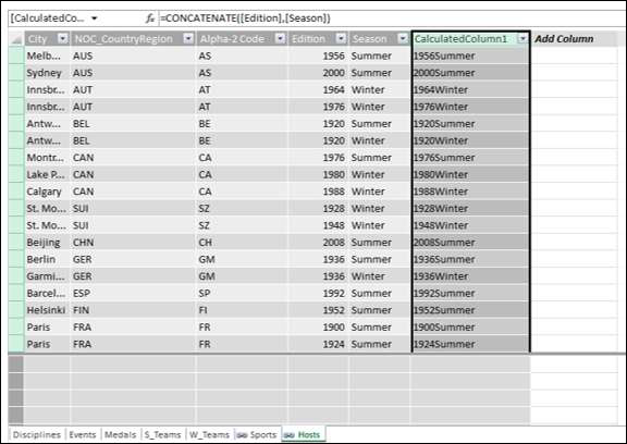
右键单击新列并从下拉列表中选择重命名列。
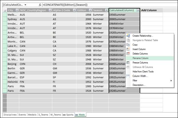
Type EditionID in the header of the new column.
As you can see, the column EditionID has unique values in the Hosts table.
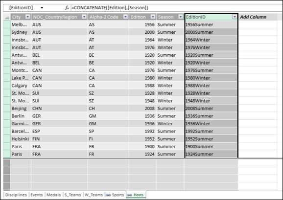
Creating a Relationship Using Calculated Columns
If you have to create a relationship between the Hosts table and the Medals table, the column EditionID should exist in the Medals table also. Create a calculated column in Medals table as follows −
-
Click on the Medals table in the Data View of Power Pivot.
-
Click the Design tab on the Ribbon.
-
Click Add.
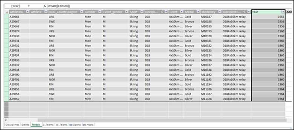
Type the DAX formula in the formula bar = YEAR ([EDITION]) and press Enter.
Rename the new column that is created as Year and click Add.
-
Type the following DAX formula in the formula bar = CONCATENATE ([Year], [Season])
-
Rename the new column that is created as EditionID.
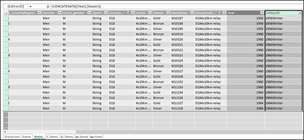
As you can observe, the EditionID column in the Medals table has identical values as the EditionID column in the Hosts table. Therefore, you can create a relationship between the tables – Medals and Sports with the EditionID field.
-
Switch to the diagram view in PowerPivot window.
-
Create a relationship between the tables- Medals and Hosts with the field that is obtained from the calculated column i.e. EditionID.
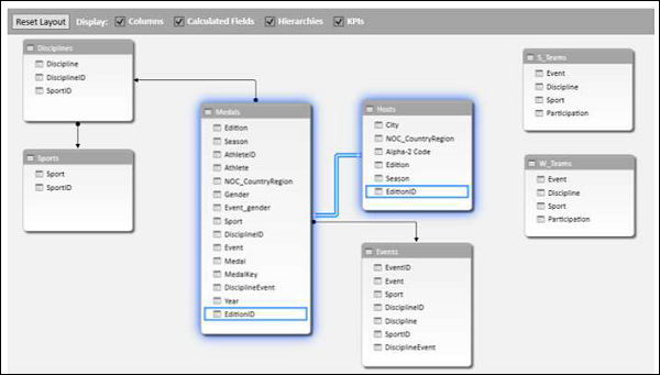
Now you can add fields from Hosts table to Power PivotTable.
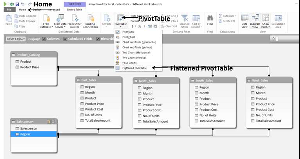
Excel Power Pivot – Flattened
When the data has many levels, sometimes it becomes cumbersome to read the PivotTable report.
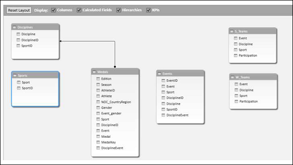
For example, consider the following Data Model.
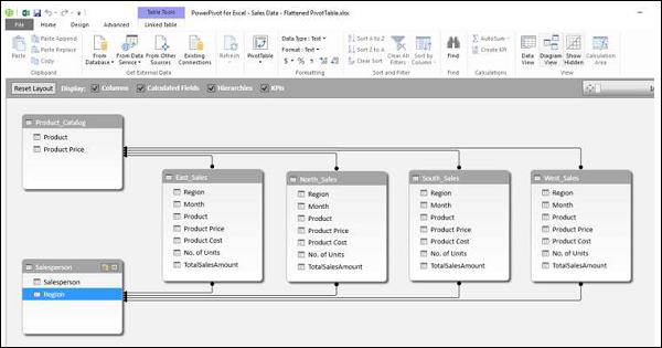
We will create a Power PivotTable and a Power Flattened PivotTable to get an understanding of the layouts.
Creating a PivotTable
You can create a Power PivotTable as follows −
-
Click the Home tab on the Ribbon in the PowerPivot window.
-
Click PivotTable.
-
Select PivotTable from the dropdown list.
An empty PivotTable will be created.
-
Drag the fields − Salesperson, Region and Product from the PivotTable Fields list to the ROWS area.
-
Drag the field − TotalSalesAmount from the Tables − East, North, South and West to the ∑ VALUES area.
As you can see, it is a bit cumbersome read such a report. If the number of entries becomes more, the more difficult it will be.
Power Pivot provides a solution for a better representation of data with Flattened PivotTable.
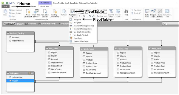
Creating a Flattened PivotTable
You can create a Power Flattened PivotTable as follows −
-
Click the Home tab on the Ribbon in the PowerPivot window.
-
Click PivotTable.
-
Select Flattened PivotTable from the dropdown list.
Create Flattened PivotTable dialog box appears. Select New Worksheet and click OK.
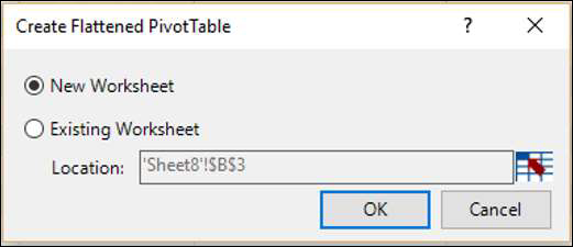
As you can observe the data is flattened out in this PivotTable.
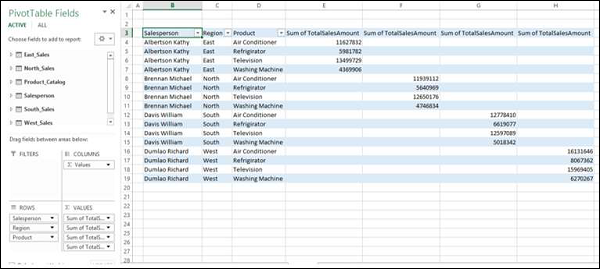
Note − In this case Salesperson, Region and Product are in ROWS area only as in the previous case. However, in the PivotTable layout, these three fields are appearing as three columns.
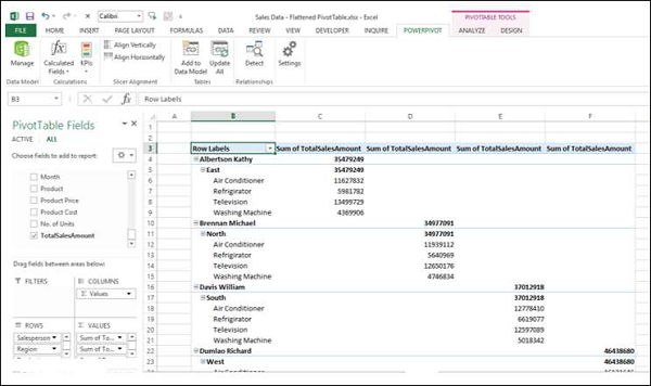
Exploring Data in Flattened PivotTable
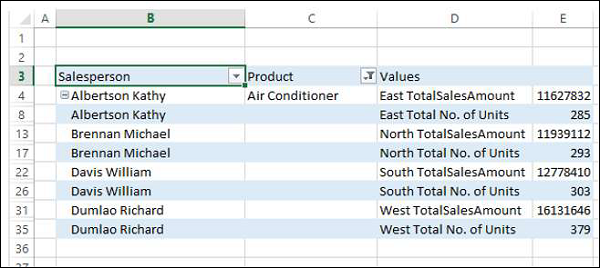
Suppose you want to summarize the sales data for the product − Air Conditioner. You can do it in a simple way with the Flattened PivotTable as follows −
-
Click the arrow next to the column header − Product.
-
Check the box Air Conditioner and uncheck the other boxes. Click OK.
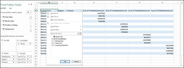
The Flattened PivotTable is filtered to the Air Conditioner sales data.
You can make it look more flattened by dragging ∑ VALUES to ROWS area from the COLUMNS area.
Rename the custom names of the summation values in the ∑ VALUES area to make them more meaningful as follows −
-
Click on a summation value, say, Sum of TotalSalesAmount for East.
-
Select Value Field Settings from the dropdown list.
-
Change the Custom Name to East TotalSalesAmount.
-
Repeat the steps for the other three summation values.
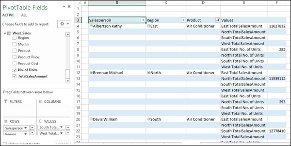
You can also summarize the number of units sold.
-
Drag No. of Units to the ∑ VALUES area from each of the tables − East_Sales, North_Sales, South_Sales and West_Sales.
-
Rename the values to East Total No. of Units, North Total No. of Units, South Total No. of Units and West Total No. of Units respectively.
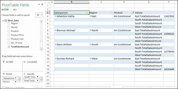
As you can observe, in both of the above tables, there are rows with empty values, as each salesperson represents a single region and each region is represented only by a single salesperson.
-
Select the rows with empty values.
-
Right click and click on Hide in the dropdown list.
All the rows with empty values will be hidden.
![]()
As you can observe, though the rows with empty values are not displayed, the information on the Salesperson also got hidden.
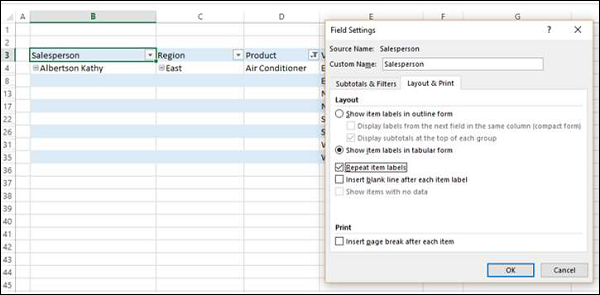
-
Click on the column header − Salesperson.
-
Click the ANALYZE tab on the Ribbon.
-
Click Field Settings. The Field Settings dialog box appears.
-
Click the Layout & Print tab.
-
Check the box – Repeat Item Labels.
-
Click OK.
As you can observe, the Salesperson information is displayed and the rows with empty values are hidden. Further, the column Region in the report is redundant, as the values in the Values column are self-explanatory.
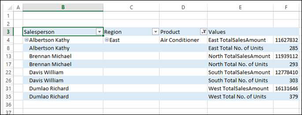
Drag the field Regions out of Area.
Reverse the order of the fields − Salesperson and Product in the ROWS area.
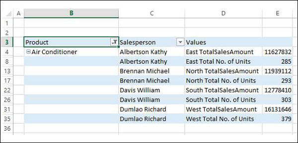
You have arrived at a concise report combining data from six tables in the Power Pivot.
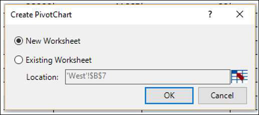
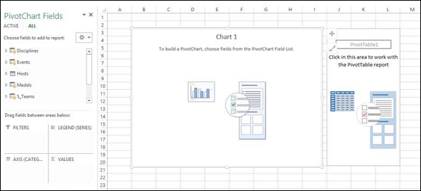
Excel Power Pivot Charts – Creation
A PivotChart based on Data Model and created from the Power Pivot window is a Power PivotChart. Though it has some features similar to Excel PivotChart, there are other features that make it more powerful.
In this chapter, you will learn about Power PivotCharts. Henceforth we refer to them as PivotCharts, for simplicity.
Creating a PivotChart
Suppose you want to create a PivotChart based on the following Data Model.
-
Click the Home tab on the Ribbon in Power Pivot window.
-
Click PivotTable.
-
Select PivotChart from the dropdown list.
The Create PivotChart dialog box appears. Select New Worksheet and click OK.
An empty PivotChart is created on a new worksheet in the Excel window.
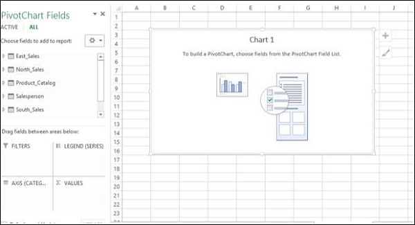
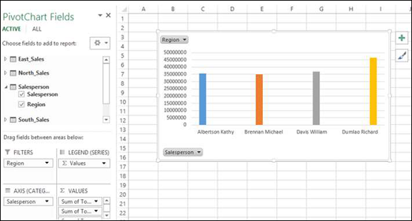
As you can observe, all the tables in the data model are displayed in the PivotChart Fields list.
-
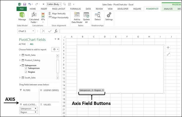
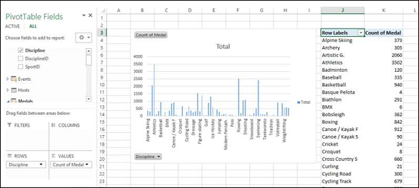
Click on the Salesperson table in the PivotChart Fields list.
-
Drag the fields − Salesperson and Region to AXIS area.
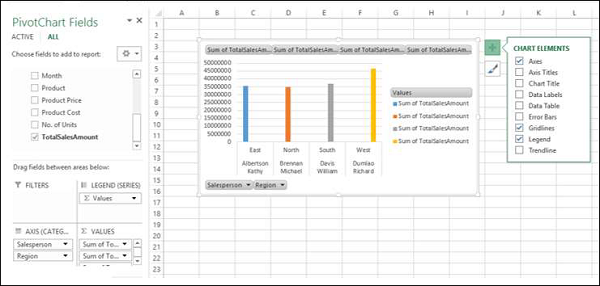
Two field buttons for the two selected fields appear on the PivotChart. These are the Axis field buttons. The use of field buttons is to filter data that is displayed on the PivotChart.
Drag TotalSalesAmount from each of the four tables– East_Sales, North_Sales, South_Sales and West_Sales to ∑ VALUES area.
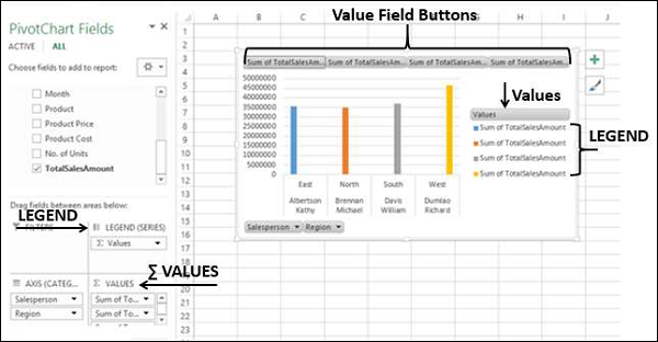
The following appear on the worksheet −
-
In the PivotChart, column chart is displayed by default.
-
In the LEGEND area, ∑ VALUES are added.
-
The Values appear in the Legend in the PivotChart, with title Values.
-
The Value Field Buttons appear on the PivotChart. You can remove the legend and the value field buttons for a tidier look of the PivotChart.
-
Click on the
 button at the top right corner of the PivotChart. The Chart Elements dropdown list appears.
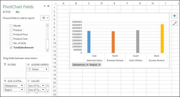
Uncheck the box Legend in the Chart Elements list. The Legend is removed from the PivotChart.

-
Right click on the value field buttons.
-
Select Hide Value Field Buttons on Chart from the dropdown list.
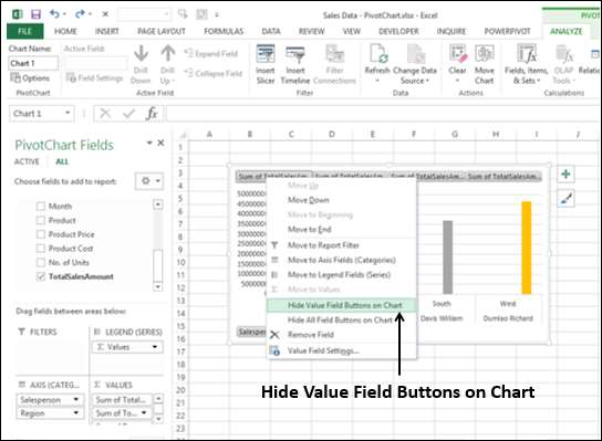
The value field buttons on the chart are removed.
Note − The display of field buttons and/or legend depends on the context of the PivotChart. You need to decide what is required to be displayed.
PivotChart Fields List
As in the case of Power PivotTable, Power PivotChart Fields list also contains two tabs – ACTIVE and ALL. Under the ALL tab, all the data tables in the Power Pivot Data Model are displayed. Under the ACTIVE tab, the tables from which the fields are added to PivotChart are displayed.
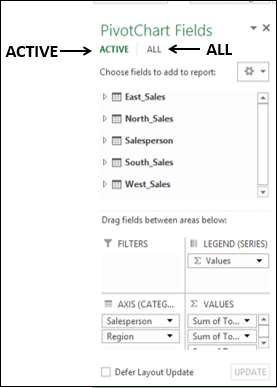
Likewise, the areas are as in the case of Excel PivotChart. There four areas are −
-
AXIS (Categories)
-
LEGEND (Series)
-
∑ VALUES
-
FILTERS
As you have seen in the previous section, Legend is populated with ∑ Values. Further, field buttons are added to the PivotChart for the ease of filtering the data that is being displayed.
Filters in PivotChart
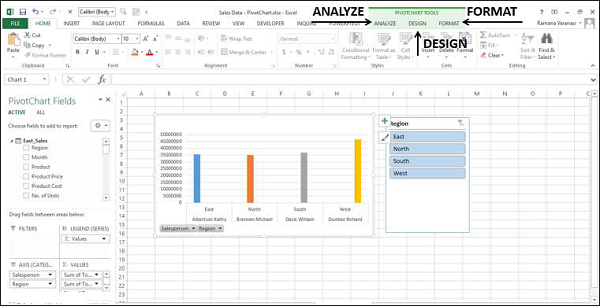
You can use the Axis field buttons on the chart to filter the data being displayed. Click on the arrow on the Axis field button – Region.

The dropdown list that appears looks as follows −
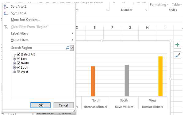
You can select the values that you want to display. Alternatively, you can place the field in FILTERS area for filtering the values.
Drag the field Region to FILTERS area. The Report Filter button – Region appears on the PivotChart.
Click on the arrow on the Report Filter button − Region. The dropdown list that appears looks as follows −
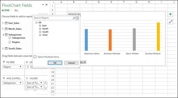
You can select the values that you want to display.
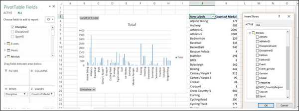
Slicers in PivotChart
Using Slicers is another option to filter data in the Power PivotChart.
-
Click the ANALYZE tab under PIVOTCHART tools on the Ribbon.
-
Click Insert Slicer in the Filter group. The Insert Slicer dialog box appears.

All the tables and the corresponding fields appear in the Insert Slicer dialog box.
Click the field Region in Salesperson table in the Insert Slicer dialog box.
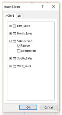
Slicer for the field Region appears on the worksheet.
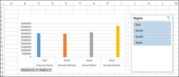
As you can observe, the Region field still exists as an Axis field. You can select the values that you want to display by clicking on the Slicer buttons.
Remember that you are able to do all these in a few minutes and also dynamically because of the Power Pivot Data Model and defined relationships.
PivotChart Tools
In Power PivotChart, the PIVOTCHART TOOLS has three tabs on the Ribbon as against two tabs in Excel PivotChart −
-
ANALYZE
-
DESIGN
-
FORMAT
The third tab − FORMAT is the additional tab in Power PivotChart.
Click the FORMAT tab on the Ribbon.
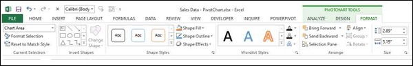
The options on the Ribbon under FORMAT tab are all for adding splendor to your PivotChart. You can use these options judiciously, without getting over bored.
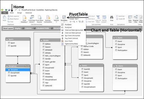
Table and Chart Combinations
Power Pivot provides you with different combinations of Power PivotTable and Power PivotChart for data exploration, visualization, and reporting. You have learnt the PivotTables and PivotCharts in the previous chapters.
In this chapter, you will learn how to create the Table and Chart combinations from within the Power Pivot window.
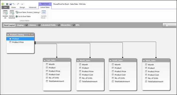
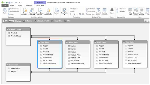
Consider the following Data Model in Power Pivot that we will use for illustrations −
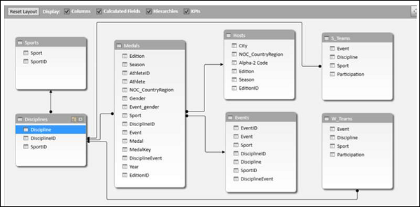
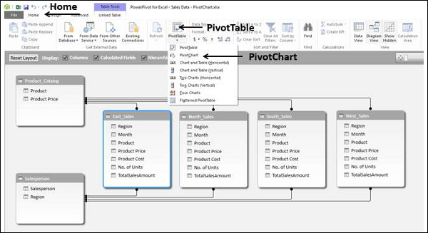
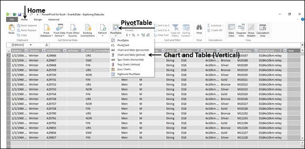
Chart and Table (Horizontal)
With this option, you can create a Power PivotChart and a Power PivotTable, one next another horizontally in the same worksheet.
-
Click the Home tab in Power Pivot window.
-
Click PivotTable.
-
Select Chart and Table (Horizontal) from the dropdown list.
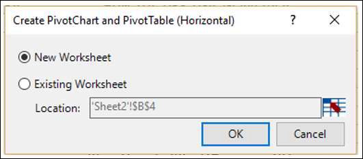
Create PivotChart and PivotTable (Horizontal) dialog box appears. Select New Worksheet and click OK.
An empty PivotChart and an empty PivotTable appear on a new worksheet.
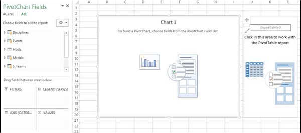
-
Click on the PivotChart.
-
Drag NOC_CountryRegion from Medals table to the AXIS area.
-
Drag Medal from Medals table to the ∑ VALUES area.
-
Right click on the Chart and select Change Chart Type from the dropdown list.
-
Select Area Chart.
-
Change the Chart Title to Total No. of Medals − Country Wise.
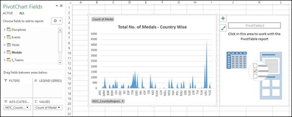
As you can see, USA has the highest number of Medals (> 4500).
-
Click on the PivotTable.
-
Drag Sport from the Sports table to the ROWS area.
-
Drag Medal from the Medals table to the ∑ VALUES area.
-
Drag NOC_CountryRegion from Medals table to FILTERS area.
-
Filter the NOC_CountryRegion field to the value USA.
Change the PivotTable Report Layout to Outline Form.
-
Deselect Sport from the Sports table.
-
Drag Gender from the Medals table to the ROWS area.
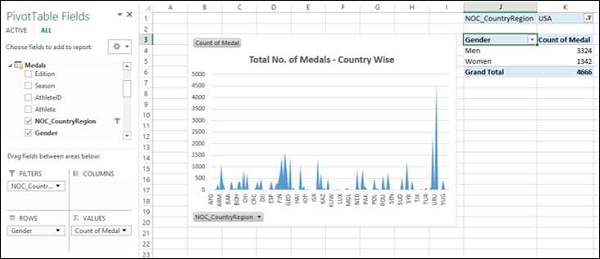
Chart and Table (Vertical)
With this option, you can create a Power PivotChart and a Power PivotTable, one below another vertically in the same worksheet.
-
Click the Home tab in Power Pivot window.
-
Click PivotTable.
-
Select Chart and Table (Vertical) from the dropdown list.
The Create PivotChart and PivotTable (Vertical) dialog box appears. Select New Worksheet and click OK.
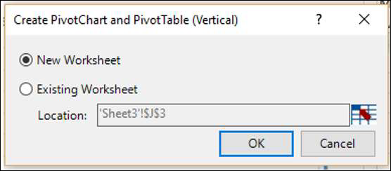
An empty PivotChart and an empty PivotTable appear vertically on a new worksheet.
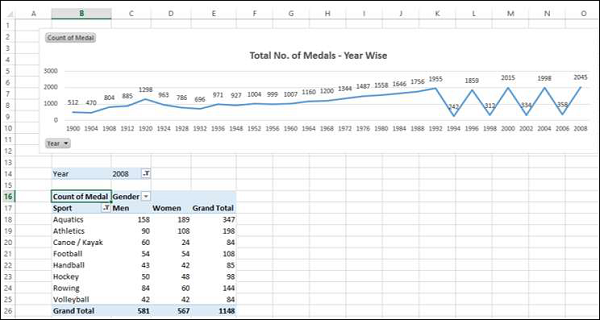
-
Click on the PivotChart.
-
Drag Year from the Medals table to AXIS area.
-
Drag Medal from the Medals table to ∑ VALUES area.
-
Right click on the Chart and select Change Chart Type from the dropdown list.
-
Select Line Chart.
-
Check the box Data Labels in the Chart Elements.
-
Change the Chart Title to Total No. of Medals – Year Wise.

As you can observe, year 2008 has the highest number of Medals (2450).
-
Click on the PivotTable.
-
Drag Sport from the Sports table to the ROWS area.
-
Drag Gender from the Medals table to the ROWS area.
-
Drag Medal from the Medals table to the ∑ VALUES area.
-
Drag Year from the Medals table to the FILTERS area.
-
Filter the Year field to the value 2008.
-
Change the Report Layout of PivotTable to Outline Form.
-
Filter the field Sport with Value Filters to Greater than or equal to 80.
Excel Power Pivot – Hierarchies
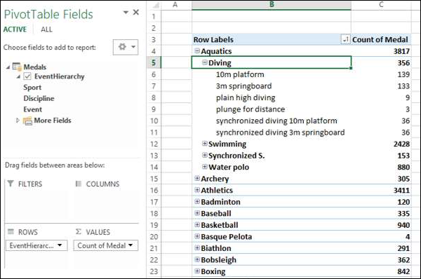
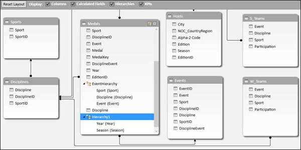
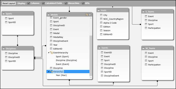
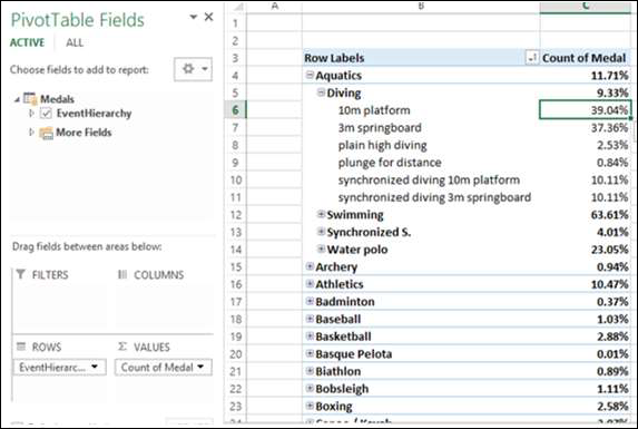
A hierarchy in Data Model is a list of nested columns in a data table that are considered as a single item when used in a Power PivotTable. For example, if you have the columns − Country, State, City in a data table, a hierarchy can be defined to combine the three columns into one field.
In the Power PivotTable Fields list, the hierarchy appears as one field. So, you can add just one field to the PivotTable, instead of the three fields in the hierarchy. Further, it enables you to move up or down the nested levels in a meaningful way.
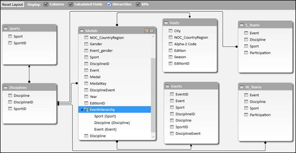
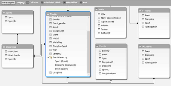
Consider the following Data Model for illustrations in this chapter.
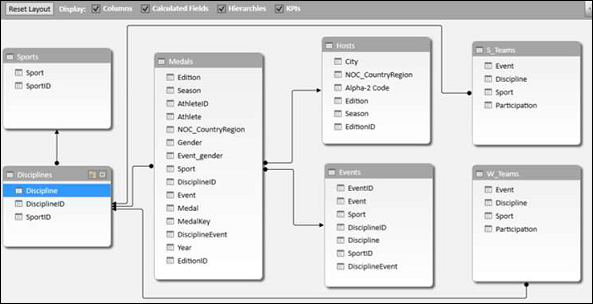
Creating a Hierarchy
You can create Hierarchies in the diagram view of the Data Model. Note that you can create a hierarchy based on a single data table only.
-
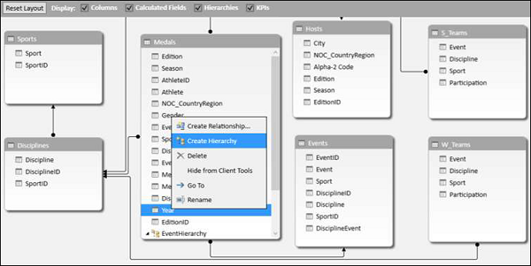
Click on the columns − Sport, DisciplineID and Event in the data table Medal in that order. Remember that the order is important to create a meaningful hierarchy.
-
Right-click on the selection.
-
Select Create Hierarchy from the dropdown list.
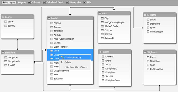
The hierarchy field with the three selected fields as the child levels gets created.

Renaming a Hierarchy
To rename the hierarchy field, do the following −
-
Right click on Hierarchy1.
-
Select Rename from the dropdown list.
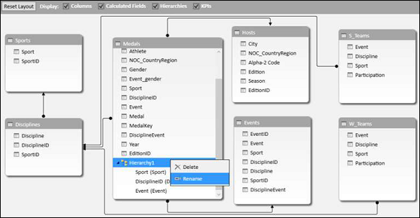
Type EventHierarchy.
Creating a PivotTable with a Hierarchy in Data Model
You can create a Power PivotTable using the hierarchy that you created in the Data Model.
-
Click the PivotTable tab on the Ribbon in the Power Pivot window.
-
Click PivotTable on the Ribbon.
The Create PivotTable dialog box appears. Select New Worksheet and click OK.
An empty PivotTable is created in a new worksheet.
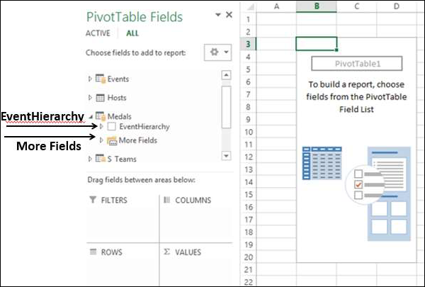
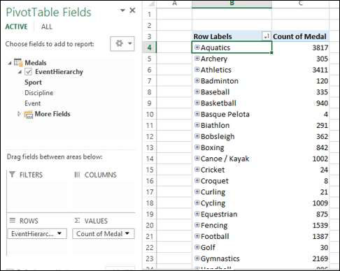
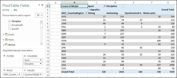
In the PivotTable Fields list, EventHierarchy appears as a field in Medals table. The other fields in the Medals table are collapsed and shown as More Fields.
-
Click on the arrow
 in front of EventHierarchy.
 -
Click on the arrow
in front of More Fields.
The fields under EventHierarchy will be displayed. All the fields in the Medals table will be displayed under More Fields.

As you can observe, the three fields that you added to the hierarchy also appear under More Fields with check boxes. If you do not want them to appear in the PivotTable Fields list under More Fields, you have to hide the columns in the data table – Medals in data view in Power Pivot Window. You can always unhide them whenever you want.
Add fields to the PivotTable as follows −
-
Drag EventHierarchy to ROWS area.
-
Drag Medal to ∑ VALUES area.
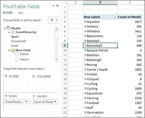
The values of Sport field appear in the PivotTable with a + sign in front of them. The medal count for each sport is displayed.
-
Click on the + sign before Aquatics. The DisciplineID field values under Aquatics will be displayed.
-
Click on the child D22 that appears. The Event field values under D22 will be displayed.
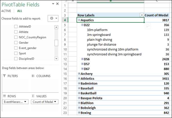
As you can observe, medal count is given for the Events, that get summed up at the parent level − DisciplineID, that get further summed up at the parent level − Sport.
Creating a Hierarchy based on Multiple Tables
Suppose you want to display the Disciplines in the PivotTable rather than DisciplineIDs to make it a more readable and understandable summarization. In order to do this, you need to have the field Discipline in Medals table that as you know is not. Discipline field is in Disciplines data table, but you cannot create a hierarchy with fields from more than one table. But, there is a way to obtain the required field from the other table.
As you are aware, the tables − Medals and Disciplines are related. You can add the field Discipline from Disciplines table to the Medals table, by creating a column using the relationship with DAX.
-
Click data view in Power Pivot window.
-
Click the Design tab on the Ribbon.
-
Click Add.
The column − Add Column on the right side of the table is highlighted.
Type = RELATED (Disciplines [Discipline]) in the formula bar. A new column − CalculatedColumn1 is created with the values as Discipline field values in the Disciplines table.
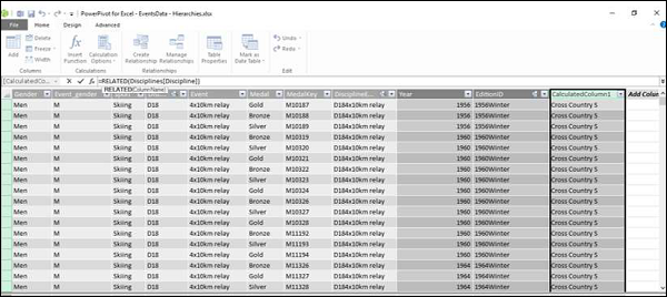
Rename the new column thus obtained in the Medals table as Discipline. Next, you have to remove DisciplineID from the Hierarchy and add Discipline, which you will learn in the following sections.
Removing a Child Level from a Hierarchy
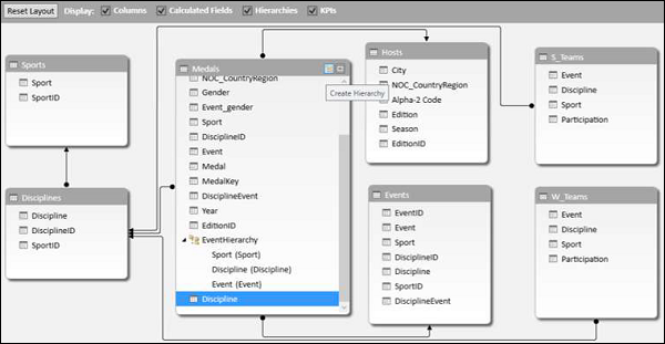
As you can observe, the hierarchy is visible in the diagram view only, and not in the data view. Hence, you can edit a hierarchy in the diagram view only.
-
Click on the diagram view in the Power Pivot window.
-
Right click DisciplineID in EventHierarchy.
-
Select Remove from Hierarchy from the dropdown list.
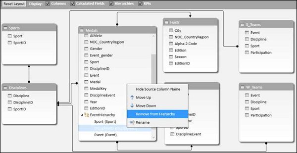
The Confirm dialog box appears. Click Remove from Hierarchy.

The field DisciplineID gets deleted from the hierarchy. Remember that you have removed the field from hierarchy, but the source field still exists in the data table.
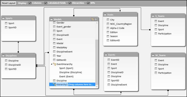
Next, you need to add Discipline field to EventHierarchy.
Adding a Child Level to a Hierarchy
You can add the field Discipline to the existing hierarchy – EventHierarchy as follows −
-
Click on the field in Medals table.
-
Drag it to the Events field below in the EventHierarchy.
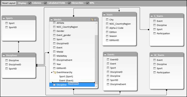
The Discipline field gets added to EventHierarchy.

As you can observe, the order of the fields in EventHierarchy is Sport–Event–Discipline. But, as you are aware it has to be Sport–Discipline-Event. Hence, you need to change the order of the fields.
Changing the Order of a Child Level in a Hierarchy
To move the field Discipline to the position after the field Sport, do the following −
-
Right click on the field Discipline in EventHierarchy.
-
Select Move Up from the dropdown list.
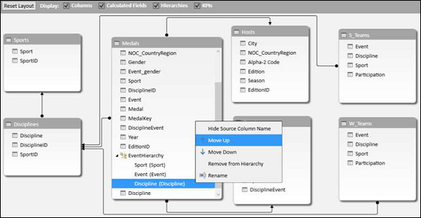
The order of the fields changes to Sport-Discipline-Event.

PivotTable with Changes in Hierarchy
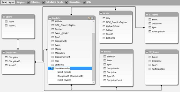
To view the changes that you made in EventHierarchy in the PivotTable, you need not create a new PivotTable. You can view them in the existing PivotTable itself.
Click on the worksheet with the PivotTable in Excel window.
As you can observe, in the PivotTable Fields list, the child levels in the EventHierarchy reflect the changes you made in the Hierarchy in Data Model. The same changes also get reflected in the PivotTable accordingly.
Click the + sign in front of Aquatics in the PivotTable. The child levels appear as values of the field Discipline.
Hiding and Showing Hierarchies
You can choose to hide the Hierarchies and show them whenever you want.
-
Uncheck the box Hierarchies in the top menu of diagram view to hide the hierarchies.
-
Check the box Hierarchies to show the hierarchies.
Creating a Hierarchy in Other Ways
In addition to the way you created hierarchy in the previous sections, you can create a hierarchy in another two ways.
1. Click the Create Hierarchy button on the top right corner of the Medals data table in diagram view.
A new hierarchy gets created in the table without any fields in it.
Drag the fields Year and Season, in that order to the new hierarchy. The hierarchy shows the child levels.
2. Another way of creating the same hierarchy is as follows −
-
Right click on the field Year in the Medals data table in diagram view.
-
Select Create Hierarchy from the dropdown list.
A new hierarchy is created in table with Year as a child field.
Drag the field season to the hierarchy. The hierarchy shows the child levels.

Deleting a Hierarchy
You can delete a hierarchy from the Data Model as follows −
-
Right click on the hierarchy.
-
Select Delete from the dropdown list.
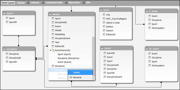
The Confirm dialog box appears. Click Delete from Model.
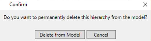
The hierarchy gets deleted.
Calculations Using Hierarchy
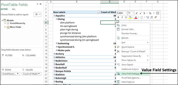
You can create calculations using a hierarchy. In the EventsHierarchy, you can display the number of medals at a child level as a percentage of the number of medals at its parent level as follows −
-
Right click on a Count of Medal value of an Event.
-
Select Value Field Settings from the dropdown list.
Value Field Settings dialog box appears.
-
Click the Show Values As tab.
-
Select % of Parent Row Total from the list and click OK.
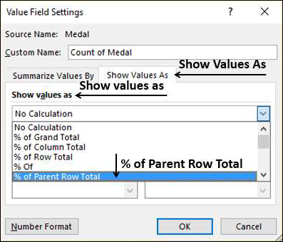
The child levels are displayed as the percentage of the Parent Totals. You can verify this by summing up the percentage values of the child level of a parent. The sum would be 100%.
Drilling Up and Drilling Down a Hierarchy
You can quickly drill up and drill down across the levels in a hierarchy using Quick Explore tool.
-
Click on a value of Event field in the PivotTable.
-
Click the Quick Explore tool –
 that appears at the bottom right corner of the cell containing the selected value.
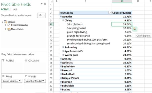
The Explore box with Drill Up option appears. This is because from Event you can only drill up as there are no child levels under it.
Click Drill Up.
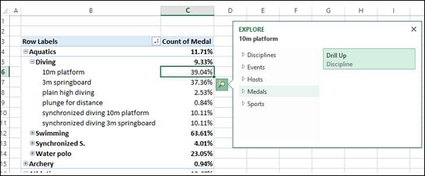
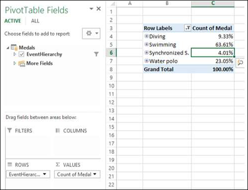
PivotTable data is drilled up to Discipline.
Click on the Quick Explore tool – that appears at the bottom right corner of the cell containing a value.
Explore box appears with Drill Up and Drill Down options displayed. This is because from Discipline you can drill up to Sport or drill down to Event.

This way you can quickly move up and down the hierarchy.
Excel Power Pivot – Aesthetic Reports
You can create aesthetic reports of your data analysis with Power Pivot Data that is in Data Model.
The important features are −
-
You can use PivotCharts to produce visual reports of your data. You can use Report Layouts to structure your PivotTables to make them easily readable.
-
You can insert Slicers for filtering data in the report.
-
You can use a common Slicer for both the PivotChart and the PivotTable that are in the same report.
-
Once your final report is ready, you can choose to hide the Slicers form the display.
You will learn how to get reports with the options that are available in Power Pivot in this chapter.
Consider the following Data Model for illustrations in this chapter.
Reports based on Power PivotChart
Create a Power PivotChart as follows −
-
Click the Home tab on the Ribbon in PowerPivot window.
-
Click PivotTable.
-
Select PivotChart from the dropdown list.
-
Click New Worksheet in the Create PivotChart dialog box.
An empty PivotChart is created in a new worksheet in Excel window.
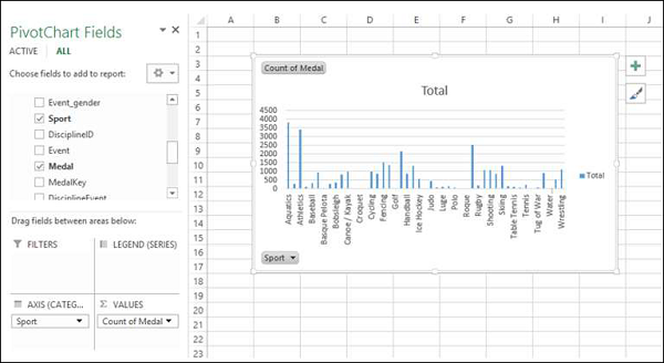
-
Drag Sport from Medals table to Axis area.
-
Drag Medal from Medals Table to ∑ VALUES area.
-
Click the ANALYZE tab in PIVOTTABLE TOOLS on the Ribbon.
-
Click Insert Slicer in the Filter Group. The Inset Slicers dialog box appears.
-
Click the field NOC_CountryRegion in the Medals table.
-
Click OK.
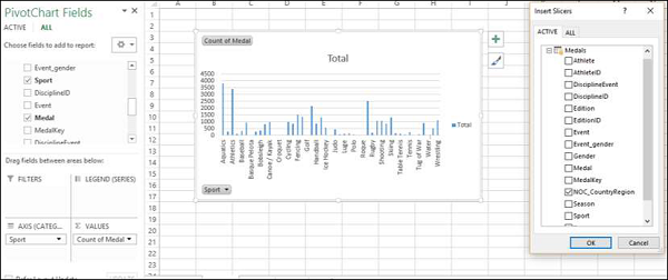
The Slicer NOC_CountryRegion appears.
-
Select USA.
-
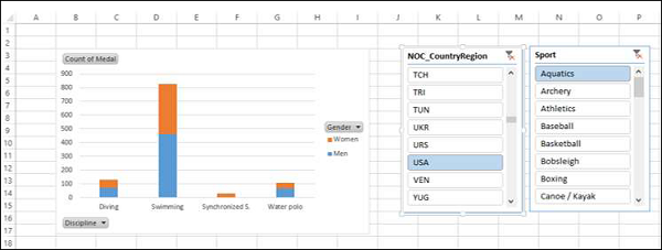
Drag Gender from Medals table to GENDER area.
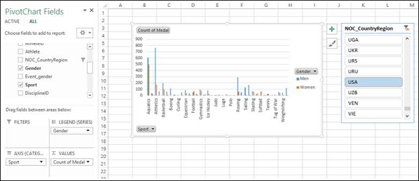
-
Right click on the PivotChart.
-
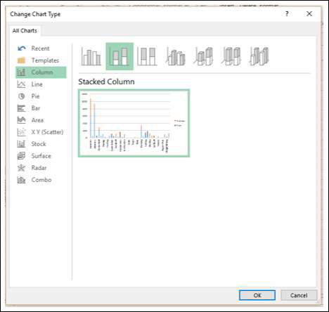
Select Change Chart Type from the dropdown list.
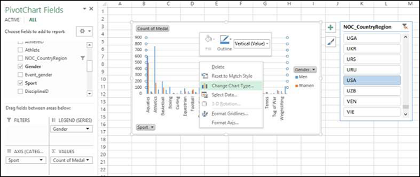
The Change Chart Type dialog box appears.
Click on Stacked Column.
-
Insert Slicer for Sport field.
-
Drag Discipline from Disciplines table to AXIS area.
-
Remove the field Sport from AXIS area.
-
Select Aquatics in the Slicer – Sport.
Report Layout
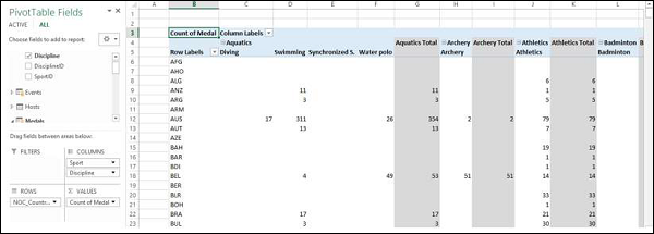
Create PivotTable as follows −
-
Click on Home tab on the Ribbon in PowerPivot window.
-
Click on PivotTable.
-
Click on PivotTable in the dropdown list. The Create PivotTable dialog box appears.
-
Click on New Worksheet and click Ok. An empty PivotTable gets created in a new worksheet.
-
Drag NOC_CountryRegion from Medals table to AXIS area.
-
Drag Sport from Medals table to COLUMNS area.
-
Drag Discipline from Disciplines table to COLUMNS area.
-
Drag Medal to ∑ VALUES area.
Click on the arrow button next to Column Labels and select Aquatics.
-
Click on the arrow button next to Row Labels.
-
Select Value Filters from the dropdown list.
-
Select Greater Than Or Equal To from the second dropdown list.
Type 80 in the box next to Count of Medal is greater than or equal to in the Value Filter dialog box.
-
Click the DESIGN tab in PIVOTTABLE TOOLS on the Ribbon.
-
Click on Subtotals.
-
Select Do Not Show Subtotals fromn the dropdown list.
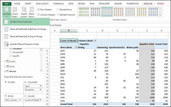
The Subtotals column – Aquatics Total gets removed.
Click Report Layout and select Show in Outline Form from the dropdown list.
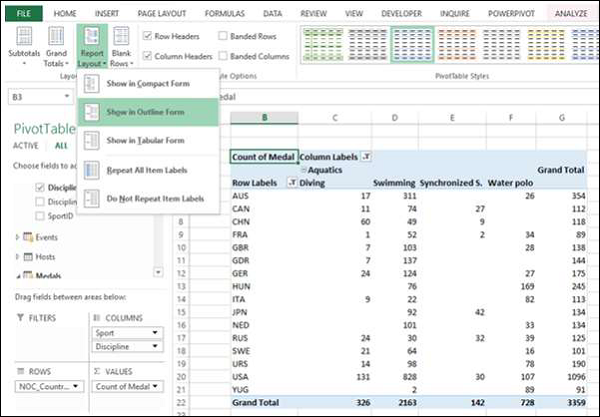
Check the box Banded Rows.
The field names appear in place of Row Labels and Column Labels and the report looks self-explanatory.
Using a Common Slicer
Create a PivotChart and PivotTable next to each other.
-
Click the Home tab on the Ribbon in PowerPivot tab.
-
Click PivotTable.
-
Select Chart and Table (Horizontal) from the dropdown list.
The Create PivotChart and PivotTable (Horizontal) dialog box appears.
Select New Worksheet and click OK. An Empty PivotChart and an empty PivotTable appear next to each other in a new worksheet.
-
Click PivotChart.
-
Drag Discipline from Disciplines table to AXIS area.
-
Drag Medal from Medals table to ∑ VALUES area.
-
Click PivotTable.
-
Drag Discipline from Disciplines table to ROWS area.
-
Drag Medal from Medals table to ∑ VALUES area.
-
Click the ANALYZE tab in PIVOTTABLE TOOLS on the Ribbon.
-
Click Insert Slicer. The Insert Slicers dialog box appears.
-
Click on NOC_CountryRegion and Sport in Medals table.
-
Click OK.
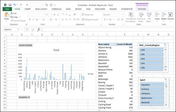
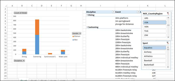
Two Slicers – NOC_CountryRegion and Sport appear. Arrange and size them to align properly next to the PivotTable.
-
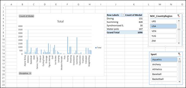
Select USA in the NOC_CountryRegion Slicer.
-
Select Aquatics in the Sport Slicer. The PivotTable is filtered to the selected values.
As you can observe, the PivotChart is not filtered. To filter PivotChart with the same filters, you need not insert Slicers again for PivotChart. You can use the same Slicers that you have used for the PivotTable.
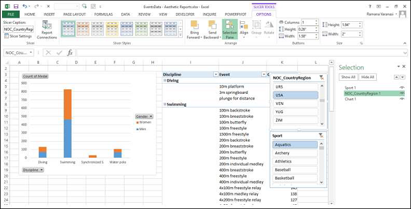
-
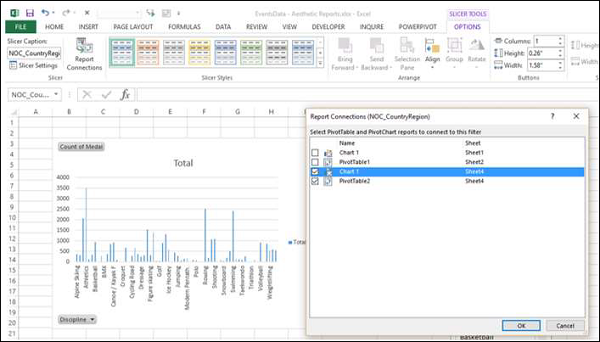
Click on NOC_CountryRegion Slicer.
-
Click the OPTIONS tab in SLICER TOOLS on the Ribbon.
-
Click Report Connections in the Slicer group. The Report Connections dialog box appears for the NOC_CountryRegion Slicer.
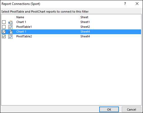
You can see that all the PivotTables and PivotCharts in the workbook are listed in the dialog box.
-
Click on the PivotChart that is in the same worksheet as the selected PivotTable and click OK.
-
Repeat for Sport Slicer.
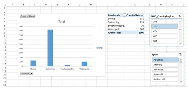
The PivotChart is also filtered to the values selected in the two Slicers.
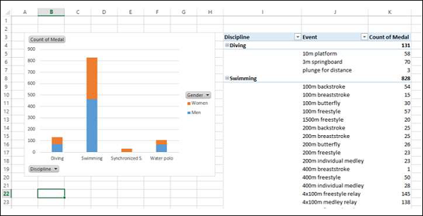
Next, you can add details to the PivotChart and PivotTable.
-
Click the PivotChart.
-
Drag Gender to LEGEND area.
-
Right click on the PivotChart.
-
Select Change Chart Type.
-
Select Stacked Column in the Change Chart Type dialog box.
-
Click on the PivotTable.
-
Drag Event to ROWS area.
-
Click the DESIGN tab in PIVOTTABLE TOOLS on the Ribbon.
-
Click Report Layout.
-
Select Outline Form from the dropdown list.
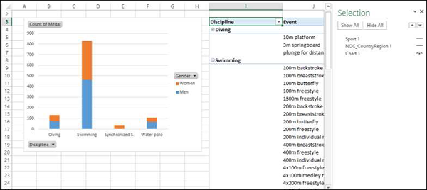
Selecting Objects for Display in the Report
You can choose not to display the Slicers on the final Report.
-
Click the OPTIONS tab in SLICER TOOLS on the Ribbon.
-
Click Selection Pane in Arrange group. The Selection Pane appears on the right side of the window.

As you can observe, the symbol  appears next to the objects in the Selection Pane. This means those objects are visible.
-
单击
NOC_CountryRegion 旁边的符号。 -
单击
运动旁边的符号。两者的符号都更改 为 。这意味着两个切片器的可见性已关闭。
关闭选择窗格。
您可以看到两个切片器在报告中不可见。
